G A N Z E E R . R E V I E W S

Jim Rugg o-o-o

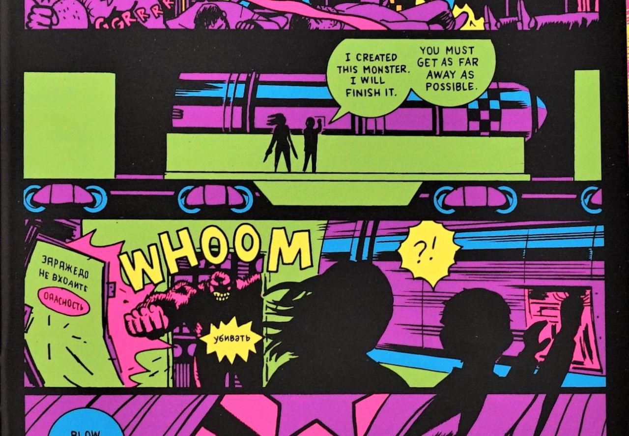
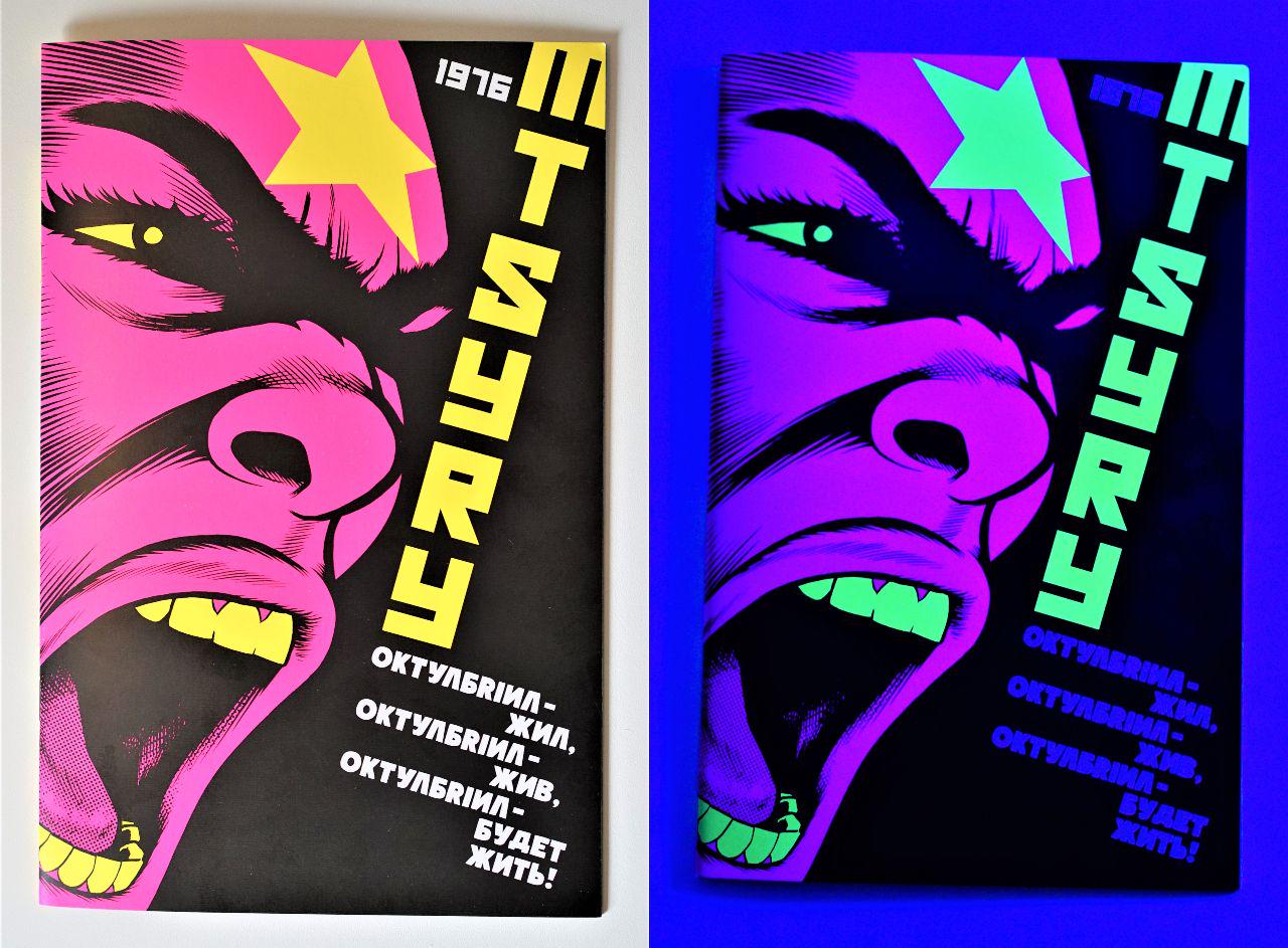
A comic about a mythical public domain revolutionary created in hiding by underground cartoonist networks in Kiev? Brought back to life by Jim Rugg in glorious fluorescent black-light inks?

This, without even thinking about it for a split second, blows all my whistles. From the subject matter to the character's peculiar history, to the unique printing treatment, to the very cartoonist behind this revival, I was all in, and jumped at the chance to back this comicbook on Kickstarter as soon as it was announced.

Fluorescent inks aside however, the end result is largely underwhelming. The story follows Robot's Stalin's plans to test a terabomb in Northern Siberia, home of the indigenous Nanets. Word gets out and makes it to the PPP Party (Progressive Political Pornography) prompting Octobriana to stop Robot Stalin before it's too late! Decent enough setup that takes all of four pages, with the rest of the comic following Octobriana's mission. This wouldn't be too bad if the mission was at all challenging, but Octobriana romps throug it like a badass from start to finish.

I expected a bit more meat to this story. Given the character's history, Octobriana is ripe for something a little more deconstructive, and maybe even an opportunity to explore ideas around communism, capitalism, democracy, and dictatorship (and pornography!). Granted, that may be too much to ask of a 24-page comicbook. I do love the fun, lighthearted humor of the thing, but most of that lies in the first four pages, with the rest being straight action comix, and not entirely exciting action comix at that. Honestly the completely unchallenging action sequences wouldn't have bothered me had some of the key “money shots” been rendered with far more badassery by Rugg. Instead, they're given the same treatment an artist might give a throwaway panel.

Examples:

  • Octobriana and a rescued scientist riding some kind of Dimorphodon/dragon thing. Even though this panel takes up half a page, it is underwhelmingly illustrated with the flying creature silhoutted and the characters simplistically rendered, at an angle that hardly gives this moment the larger than life feel it deserves.

  • Octobriana and same scientist finally find the terabomb on a moving train (top image, right page, middle panel). A chance to draw this weapon in all the larger than life terror it deserves, completely lost.

  • As the scientist hurriedly works his magic on the bomb (on the moving train), a mutated monster appears to stop them (top)! What should be a stressful, high octane, startling moment is instead just kinda meh.

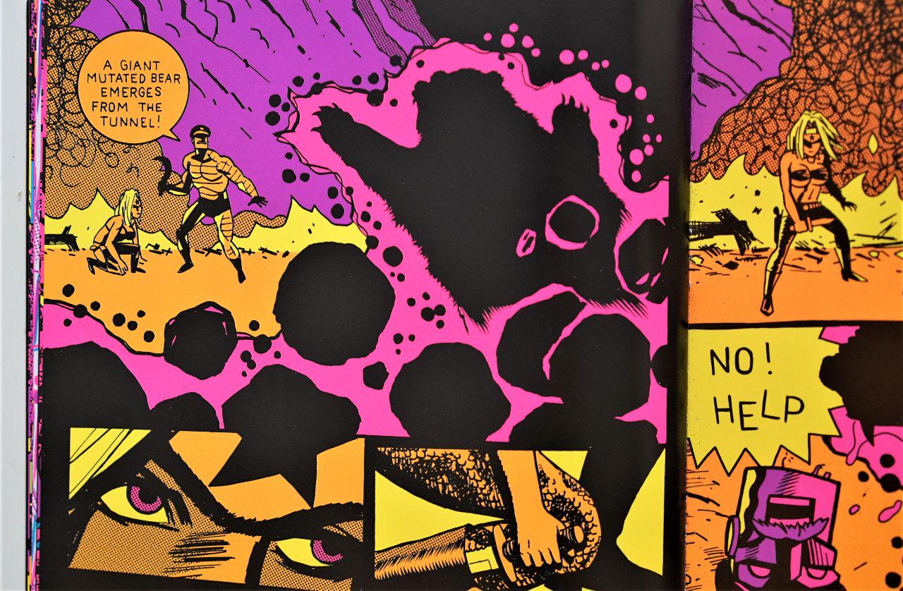
  • Octobriana in a tank blowing the monster to shreds! Yes!! A double-page spread! Look at that “BOOM”! Glorious lettering and glorious colors, but this awesome tank taking up a spread is rendered in the same simplistic way it might be depicted in a thumbnail. The tank here is just asking to be far more awesome!

  • A half page for a silhouetted Apache helicopter?

Honestly, I could go on and on about all the lost money shots, because lost money shots is pretty much what makes up most of OCTOBRIANA 1976, but the kicker for me was on the page before the last:

C'mon, man! A mutated bear emerging from the rubble and that's how you choose to depict it?

Generally speaking, I'm a big fan of Jim Rugg's cartooning! He's one of the rare artists in the field who operates at the intersection of what is commonly understood to be cartooning, and graphic design, and other illustration arts, and generally has a good compass for oscillating between which muscles to lean on throughout any given yarn. This special sauce so particular to Rugg's craft isn't very much on display in OCTOBRIANA 1976 though, and instead we're presented with comicbook full of poor storytelling choices.

As disappointing as OCTOBRIANA 1976 is, I don't regret backing it on Kickstarter, and am happy to have participated in funding this fun experiment by Jim Rugg, which I'm willing to bet is but a miniature prototype of far more awesome things to come. One must commend Rugg on the efficiency with which he handled his entire kickstarter, from launch to promotion to production and extremely timely delivery. I do hope we see more kickstarters from Rugg for more fiercely independent output. I have a feeling we have yet to see the extent of what this unique artist is capable of.

That is the hope anyway.

[Buy]

#comix

Caza o-o-o-o

My awareness of Caza largely pertains to his cover-art for various French science fiction publications, specifically periodicals such as FICTION and GALAXIE. Proving my ignorance of much of the comix landscape, I had absolutely no idea that he did comix as well, so it was with utter excitement and glee that I discovered Heavy Metal had not only published a translated collection of his works, but that their website had it on sale (for as low as $5.12 at the time of purchase, cover price $12.95)!

Caza's line art is clearly the demented lovechild of Moebius and Druillet, an exceptional combination. His color work I would argue surpasses both, bringing forth a quality that is at once painterly as well as designy; with gradients used minimally (and traditionally) in conjunction with flats within a color palette that rarely exceeds a handful of hues. This, together with his incredibly considered compositions make each and every page within this tome worthy of its own poster. Such a statement in my mind would mean the end result probably wouldn't bode well for sequential storytelling (something say, Sergio Toppi—who I love— is often guilty of), but THE AGE OF DARKNESS is evidence that Caza may be the shining exception to the rule.

The stories in THE AGE OF DARKNESS are surreal and suggestive rather than plot or character driven. Dialogue is rarely spoken, and instead panels are accompanied by poetic prose (but also sometimes by rather redundant descriptions of what you're already looking at).

The opening story, “Clouds”, is the least weird in the collection. This 4-pager dated 1979 gave me a tinge of my own THE SOLAR GRID (or more accurately the other way around); a child contemplating a sky thick with elaborate clouds is interrupted by rain, prompting him to don his protective suit, because—as it turns out—the rain is acidic and poisonous. The second story, “The Flute Player” dated a mere year after the first, is a grand leap into weird. A wandering man passes through the great metallic city of the “Oms” before settling on its outskirts and carving a flute out of a lonesome bush. Upon playing it, he is attacked by the Oms and driven out of the city. He returns and plays his flute again, but this time... the Oms are driven to mass suicide, and the closing panel reveals that the flute is different, that this time... it is fashioned out of bone.

Bone from the wanderer's own leg.

And the stories only get weirder. They tend to follow a similar structure though, where there's a buildup to a final panel reveal. These don't offer any concrete statements or notions (not that they don't intend to) but rather they put you in a contemplative state of mind, a space that is part philosophical and part dream-logic.

Beautiful, timeless little think-pieces that you can just pick up at any point in your day and instantly induce your life with a little beauty and thoughtfulness (and quite often some wicked disturbance).

Cannot recommend enough.

[Buy]

#comix

Jack Kirby o-o-o

Jack Kirby's NEW GODS isn't good comix, but it's pretty great Kirby comix. What I mean by that is, objectively speaking and judged with other great comix in mind, NEW GODS is an incredibly underwhelming and laughable read. But if you enter NEW GODS with Jack Kirby in mind, you'll likely get a kick out of it because this is Jack Kirby at his Kirbyest, fully leaning into all the things that became his trademarks: krackles and explosions, fighting superheroics, new characters with new inventive costumes being introduced every other page, along with throwaway sci-fi concepts.

The premise is interesting enough; the old gods have perished and from their destruction arose the New Gods. This bit is only really explored in brief over two pages, afterwards it's all about the drama and brimming war between the New Gods, namely those of New Genesis and those of Apokolips, two sister planets wherein the former is bright, colorful, and joyful and the latter is dark, doomed, and miserable.

The series starts off with Orion returning to New Genesis from... well, it isn't entirely clear where. A battle of some kind is hinted at, but in any case there is great commotion surrounding his return and his summoning by High Father, a chieftain figure of New Genesis. There, Orion is taken to The Source, an ancient wall that survived the “fiery holocaust” of the old gods. Then appears Metron, a mysterious knowledge-hunter who moves effortlessly through space-time in his throne-like Mobius Chair. And the wall pronounces its marching orders: “Orion to Apokolips—then to Earth—then to War.”

This directive amuses the mysterious Metron who mumbles to himself “How wondrously wise is The Source! Who is more ready to fight the father—than the son!”

Thus it is revealed that Darkseid, ruler of Apokolopis, is Orion's father, but it is something Orion as of yet has any knowledge of. “It is not time for him to know! You shall keep secret!” urges High Father of Metron.

This isn't giving a whole lot away, mind you, because all this occurs before the 10-page mark of what is a 400+ page epic. And within those 10 pages alone, there is the seed for enough material to build entire universes filled with all manner of story. Kirby's knack for imagination and creating the new is likely his greatest gift, but with it comes the curse of rarely following any one thread to its suggested conclusion. The thrill of introducing new threads with new characters in new exciting costumes and/or worlds is just too alluring for Kirby to resist. This frustration with holding course isn't only evident from issue-to-issue but even from panel-to-panel sometimes, where it isn't at all uncommon for Kirby to completely disregard background/setting consistency, especially towards the end of the run. Generally speaking, panel-to-panel storytelling sequentiality isn't Kirby's greatest gift; meaning the transition from one panel to the next is more akin to a jump cut, creating a bit of a jolting reading experience from start to finish, but again this likely has to do with Kirby's eagerness to draw new stuff rather than draw and redraw too much of the same. The end result is that while page readability may not be entirely smooth, each panel is worthy of being its own pop-art painting! Indeed, this is the stage of Kirby's development where he grew into becoming an aestheticist with an entirely unique vision and fingerprint. It almost feels like comix as a medium was a little too confining for Kirby at this point and he may have done very well to explore the depths of his imagination and artistry as a fine artist instead, with far less boundaries in form and function.

NEW GODS' course is clearly set in the very first issue: an inevitable showdown between Orion and Darkseid, and it does get there, but it meanders quite a bit along the way. Something that on the one hand can be exciting, especially if read as intended (a series of adventuresome episodes) but on the other hand a little frustrating if considered... hmm, novelistically (which would be unfair to do because it was never conceived as such). As episodes, Kirby does a great job of making each issue its own exciting stand alone battle comic, always introducing a new character, a new challenge, and intriguing new concepts. Naturally though, some episodes are better than others. Issue #7 has got to be the undisputed high point in the series, presenting us with a gloriously operatic backstory to what will become the everlasting feud between New Genesis and Apokolips, a complete epic filled with romance, betrayal, cosmic battles, political intrigue, and awesome fights all within a mere 24 pages. It's a landmark issue, and emblematic of the kind of work that Kirby would've really liked to do in NEW GODS if his note on the very first page is any indication: “From time to time—this kind of segment will supplement the larger tapestry of the New Gods. Thank you – Jack Kirby”

Kirby wouldn't get another chance to do this again except to some degree in issue 9 where he introduces The Bug, otherwise referred to as Forager (it's a little confusing). Another civilization of New Genesis is explored, that of the underground insectoids to which Forager is affiliated, another tale of grand drama, sacrifice, and of course, awesome battles!

Issues 4 and 5 are noteworthy for the 4-page introductions featuring Metron, the former a quick look at a young planet, and the latter a flyby “the final barrier” where a colossal being larger than a star cluster drifts shackled to “the fragments of devices”. Mad, grand, and beautiful cosmic explorations that would've been a rich and welcomed addition to the series had they been regularly incorporated into each issue. Alas, not the case. Another welcomed addition would've been more of the backup stories included in issues 5 and 7, “The Young Gods of Supertown”, shedding light on the kind of trouble the young ones of New Genesis get up to, independent of the whole Orion/Darkseid storyline. But again, we only get a couple of such installments.

Also worthy of note are issues 6 and 8, possibly the most brutal of stories Kirby has ever done, both involving grand destructive battles on Earth (especially issue 8), and both involving terrible afflictions to human bystanders making them really ahead of their time as far as superhero comix are concerned.

All in all, NEW GODS is a fabulous dossier of grand world-building, with new imaginative ideas introduced on every other page. Neither the storylines themselves nor the storytelling are anything to write home about, but the book will not let up on colorful characters, exciting compositions, and awesome technologies that only Kirby's imagination could conjure up. Within it is the seed for many a fantastic comicbook story, cosmic and street, mythological and grounded, something DC Comics missed the chance to properly build upon when Kirby was still alive. Rather than contract him for 15 pages a week, I imagine DC would've done themselves (and Kirby himself) a great service had they contracted him for just one series while overseeing a line of comix created by other artists/writers based on his NEW GODS. It's obvious that his having to work on a handful of other titles alongside NEW GODS contributed somewhat to the scattered meanderings of the tale.

In the end, Jack Kirby's NEW GODS is more an example of what could've been, rather than a story of what is. It starts off exciting and brimming with potential, but then midway through becomes little more than sad and misguided.

[Buy]

#comix

Paul Pope o-o-o-o

Paul Pope isn't my favorite writer, but he may very well be my favorite storyteller in comix. And 100% may just be my favorite of Pope's work to date. As someone who's followed Pope since his indie THB days, I suppose that's saying a lot. 100% strings three stories together into one by way of overlapping characters in a somewhat similar vein as Quentin Tarentino's PULP FICTION, albeit far more linear in its telling. Like Pulp Fiction, one of 100%'s “stories” even centers around a boxer. But more specifically, his relationship with a woman named Strel who manages a strip club but would rather start a coffee roasting company instead. The other story involves Strel's cousin Eloy and her friend Kim who begin to take a liking to one another. Eloy's a conceptual artist who lives in a former bread factory where he's been toiling away on an art installation that involves an array of teapots he's been amassing. Kim, with the help of Strel, buys a gun after a young girl was found murdered near the club. Throughout the story we are made aware of the gun's presence on Kim's person, but—in complete defiance of Chekhov's principle—the gun is never used. In fact, most of 100% would drive Chekhov up the wall, for the majority of plot points are rather pointless. Less so with the third of the book's stories, which revolves around a new dancer at Strel's club and—more importantly—a busboy she gets involved with. I suspect this one to be somewhat autobiographical and possibly for that reason the most genuine of the lot. But if we're going to be honest, plot and story are never the draw for a Paul Pope yarn. It is Pope's expressive lines that draw us in. Presented in glorious black and white, Pope's energetic ink-slinging is on full display in 100%. And it applies not just to people and their faces and body language, it's also true for building, signage, furniture, and flying blob-like police patrol crafts. Oh right, did I mention 100% is science fiction?

Cop crafts hover above the streets of New York, Che Guevara's mug adorns American money, and the strip club offers “Gastro Dances” where the intestines of dancing girls are projected live. The boxing matches are also Gastro-fights, where the insides of fighters are on full display. The visual potential offered by the latter two aren't particularly taken advantage of by Pope, so it seems like a frivolous detail that holds no purpose, be it visual or conceptual.

If it feels like I'm coming down hard on Pope, let me just say I think 100% is excellent comix. But how can that be with such a loosely formulated story? It's because—aside from the deliciously energetic draftsmanship—of all the inward qualities of the storytelling, as opposed to the outward. Because of the way Kim squeezes her scarf when her and Strel talk about the dead girl, the way John hurriedly collects dirty glasses on the job, the look on Eloy's face when steam erupts from his kettles, and the way Strel furiously taps at her handheld in an attempt to avoid a “date” with Haitious the boxer. Pope's ability to evoke emotion is quite simply unmatched. You will feel the agony felt by his characters, their reluctance, their nervousness, their joy, their excitement, and their despair. He may not craft the most meticulously machined stories, but he is able to craft very human ones. And what he does with ink on paper is simply breathtaking. The fact that all his forms come from the very same free flowing brush gives even the ashtrays on a table as much emotion as his figures. As much as his characters are expressive, the environments they inhabit are also fully evoked, from smoky rooms to loud crowded dance clubs to hot steamy showers, it's all feels so... tactile. What is it all in service of? Three love stories, I guess. A new one that works out, another new one that doesn't, and an older one that is reconciled. But actually, it isn't really about those either, it's about the little moments; resisting the urge to read a flame's diary, sake over a sushi dinner, holding a lover's broken hand.

Props must also be given to John Workman whose lettering on 100% falls so in line with the artwork that you could easily mistake it for having come from Pope's hand himself.

The book may not deliver the most groundbreaking story, and the future it portrays may not have any future shock value or any social commentary of note, but it gives you real characters, environments, and a visual narrative that is 100% Paul Pope and only Paul Pope.

And that... is good enough for me.

[Buy]

#comix

Cormac McCarthy o

I am so utterly angry at this book. It starts off good enough until you realize that the entirety of the thing is more or less the same as the first 10 pages. And if ever you wanted a blueprint for anticlimactic endings, well then no need to look any further.

And also, the subtext in this thing? Atrocious. All it wants to do is hammer in the notion that people who work in groups as a community are vicious cannibals, and the only way to possibly survive is to persevere on your own. What a load of poorly disguised Randian egoist trash.

Avoid at all costs.

#prose

Andy Warhol and Pat Hackett o-o-o-o-o

In most of his interviews, Andy Warhol wasn't very talkative and came off as hella awkward while simultaneously being kinda snarky, often dicking interviewers around. So it's quite refreshing to be getting his take on things in his own voice. 300 pages of it, no less. Sure, you can bet the actual writing was done by Pat Hacket, but you can be equally sure that the voice behind the writing belongs to no one but Andy Warhol.

“Very few people on the [West] Coast knew or cared about contemporary art, and the press for my show wasn't too good. I always have a laugh, though, when I think of how Hollywood called Pop Art a put-on! Hollywood?? I mean, when you look at the kind of movies they were making then—those were supposed to be real??”

It's also nice to see him recount his transition from his commercial art practice to his early beginning within the gallery circuit— when he was still not quite sure of himself— before he became a superstar and way before his studio became the go-to place for every major counter-cultural figure in America.

“By the time Ivan [Karp] (who worked at Leo Castelli Gallery) introduced me to Henry [Geldzahler] (who at the time was a new young 'curatorial-assistant-with-no-specific-duties' at the Met) I was keeping my commercial drawings absolutely buried in another part of the house because one of the people Ivan had brought by before had remembered me from my commercial art days and asked to see some drawings. As soon as I showed them to him, his whole attitude toward me changed. I could actually see him changing his mind about my paintings, so from then on I decided to have a firm no-show policy about the drawings. Even with Henry, it was a couple of months before I was secure enough about his mentality to show them to him.”

But if it's the explosive Factory years you're interested in, rest assured there's plenty of that as well. One of the best things about this book though is Warhol's observations about the times. Because that is very much what the book is: a window onto the 1960's through they eyes and words of Andy Warhol. It starts off in 1960 and ends in 1969. By all accounts the 60's was a very special decade in America, and Warhol's retelling definitely drives the point home

“Everything went young in '64. The kids were throwing out all the preppy outfits and the dress-up clothes that made them look like their mothers and fathers, and suddenly everything was reversed—the mothers and fathers were trying to look like their kids.”

It gets better:

“Generally speaking, girls were still pretty chubby, but with the new slim clothes coming in, they all went on diets. This was the first year I can remember seeing loads of people drink low-calorie sodas.”

And then later:

“Since diet pills are made out of amphetamine, that was one reason speed was as popular with Society as it was with street people. And these Society women would pass out the pills to the whole family, too—to their sons and daughters to help them lose weight, and to their husbands to help them work harder and stay out later. There were so many people from every level on amphetamine, and although it sounds strange, I think a lot of it was because of the new fashions.”

So you get interesting anecdotes like that, with associations and theories only someone like Warhol would come up with; Fashion made Speed popular.

He does go on tangents throughout the book, recounting other people's stories instead of his own—which I s'pose you can say is a very Warholian thing to do, isn't it? I can imagine some people getting tired of these long tangents, but I find them to be wonderful additions to Warhol's montage of the decade.

”'I gave Bob Dylan a book of my poems a couple of years ago,' Taylor [Mead] said, 'right after the first time I saw him perform. I thought he was a great poet and I told him so... And now', Taylor started to laugh, 'now when he's a big sensation and everything, he asked me for a free copy of my second book. I said 'but you're rich now—you can afford to buy it!' And he said, 'But I only get paid quarterly.'”

These asides cover a huge roster of characters, from Dylan to Jackson Pollock to Robert Rauschenberg to Jonas Mekas to Dennis Hopper to Edie Sedgwick to Jim Morrison to Lou Reed to Nico to Mick Jagger and on and on. The tone is very conversational and often gosspiy, but it isn't all mere gossip. You learn, for example, how Warhol introduced Henry Geldzahler to a young British painter by the name of David Hockney. This was before Geldzahler became curator of American Art at the Met and way before he became Commissioner of Cultural Affairs for New York City. And it was really before Andy Warhol himself became anything close to a cult figure, which he would start to become only 1-2 years later.

Hard to imagine the transition when you take into account the initial reception towards his work:

“When Ivan brought Leo Castelli up to my studio, the place was a mass, with the big canvases strewn around the living room—painting was a lot messier than drawing. Leo looked my stuff over, the Dick Tracys and the Nose Jobs in particular, and then said, 'Well, it's unfortunate, the timing, because I just took on Roy Lichtenstein, and the two of you in the same gallery would collide.”

And then later:

“Henry Geldzahler was also pounding the pavements for me. He offered me to Sidney Janis, who refused. He begged Robert Elkon. He approached Eleanor Ward, who seemed interested but said she didn't have room. Nobody, but nobody, would take me.”

Amidst the stories, the gossip, and observations, there's also the occasional tip.

“To be successful as an artist, you have to have your work shown in a good gallery for the same reason that, say, Dior never sold his originals from a counter in Woolworth's. It's a matter of marketing, among other things. If a guy has, say, a few thousand dollars to spend on a painting, he doesn't wander along the street till he sees something lying around that 'amuses' him. He wants to buy something that's going to go up and up in value, and the only way that can happen is with a good gallery, one that looks out for the artist, promotes him, and sees to it that his work is shown in the right way to the right people.”

He finally got his first New York show in the fall of '62 at Eleanor Ward's Stable Gallery (only 3 years before announcing his retirement from painting). By early '63 he'd moved his work studio from his home to an old firehouse on East 87th st, and soon thereafter he hired Gerard Malanga as his assistant, who was also instrumental in keeping Andy plugged into all the cultural happenings.

“Gerard kept up with every arty event and movement in the city—all the things that sent out fliers or advertised in the Voice. He took me to a lot of dank, musty basements where plays were put on, movies screened, poetry read—he was an influence on me in that way.”

The more things Warhol was exposed to, the more he soaked up stuff like a sponge, not just for his art, but for his very persona.

“In those days I didn't have a real fashion look yet... Eventually I picked up some style from Wynn [Chamberlain] , who was one of the first to go in for the S & M leather look.”

Perhaps some of the most interesting parts in the book is when Warhol recounts some of his efforts in film, which indeed took up the majority of the 60's despite not “bringing home the bacon” in the same way the paintings did. Even today Andy's films have yet to occupy the same place his paintings have, but in reading his retelling it's hard to think that even the most skeptical of skeptics wouldn't be able to see that there's at least a bit of genius in them. In one bit, Warhol even talks about “slow cinema” something that seems to be regaining popularity in recent years.

“That had always fascinated me, the way people could sit by a window or on a porch all day and look out and never be bored, but then if they went to a movie or a play, they suddenly objected to being bored. I always felt that a very slow film could be just as interesting as a porch-sit if you thought about it the same way.” But all in all the greatest thing about the book is that it's such a perceptive account of some of the most interesting aspects of 60's New York. There's lots on Jonas Mekas' Cinematheque, plenty on the changing neighborhoods, how the East Village was becoming all Bohemian, when the Beatles became all the rage and the Stones were having publicity issues, how fashions were quickly evolving year after year (“The masses wanted to look non-conformist, so that meant the non-conformity had to be mass-manufactured”).

I find it quite odd that in the wide array of art-related books recommended to me over the years, Andy Warhol's Popism was never mentioned once. In fact, I never even knew of the book's existence, and just happened upon it by sheer coincidence. It strikes me as essential reading to anyone interested in not just Andy Warhol, but New York's art scene in the 60's more generally, arguably the most important decade in American art and culture at large. And actually, art aside, it's an incredible telling account of the decade more generally, with Warhol's keen observations on things like fashion, music, and media. Even with Warhol's shortcomings—his obsessions with things like glamour, fame, and money, all things that come across in this here book—he still manages to do what he's always done best: hold up a mirror right in America's face.

Highly recommended.

[Buy]

#prose
by Chris Ware o-o-o-o-o

The Acme Novelty Library #20 (which you wouldn’t know was The Acme Novelty Library #20, not right away, not on first glance) sat on my shelf for about 5 years, and traveled with me between 4 different cities before finally being read. Not because it’s big or daunting in any way, but because of perhaps the tedious demeanor implied by its unique Chris-Ware-ness; the four panels that detail a character’s fall off a bike, the five panels (some of them very small) that detail the picking of a pimple, the drip-drip of a ceiling leak into a bucket. But these are the very same reasons you’d keep the book around. Over the course of consecutive moves, you’d cleanse your life of the weight of numerous books, but not this one despite not having bothered to read it not once. But every once in a while, when you do pick it up, and you do flip through it, the magic of its storytelling mechanisms are obvious enough for you to keep it around. You know, even without reading it, that it is a true work of art, and as such should stay.

When I did finally read it, I read it in one sitting and I was so very glad that I never got rid of it. Simply put, it is a work of genius.

The book focuses on the life of a single individual; Jordan Wellington Lint, from the moment of birth all the way to the time of his death as an elderly man. For this reason, Ware has ingeniously designed the book to resemble a photo album with the family name stamped on the front in gold foil. No sign that it is part of the Acme Novelty Library, and not even any sign of the author’s name. Even the spine displays only the name Jordan Wellington Lint, whose life the album covers.

The book is a character study, and the character it studies isn’t the most pleasant of people. By the time he’s in his teens, he’s a bully. In his twenties he’s a slacker. He finds Christ at some point, considers himself to have turned his life around to become a model citizen, but he actually isn’t because he’s a terrible cheat. Not to mention racist. Not overtly so, but subtly in the way most White Americans who don’t think of themselves as racist actually are.

It’s not a very easy book in that it’s heartbreaking. It’s heartbreaking to see the decisions this Jordan Lint is making, his fucking up so bad, his falling victim to his own weaknesses. But its hardest part might be in its ability to hold up a mirror to the reader and bring about deep hidden memories of one’s own fuck-ups, one’s own failures, one’s own moments of weakness.

Needless to say, Chris Ware as per his usual employs a wide array of composition and storytelling techniques that will keep you coming back to the book for study and reexamination. It is a masterclass of more things than one, and a major landmark in the history of graphic storytelling, all in just 72 pages.

Highly recommended.

[Buy]

#comix

The Brant Foundation March 6 – May 14, 2019 o-o-o-o-o

Earlier this year I showed a painting at Moniker Art Fair (NYC) within which I paid tribute to some of my greatest artistic influence, most prominently was a depiction of Jean-Michel Basquiat. More than once I was approached by visitors asking me to tell them what the big deal with Basquiat is all about. A position that is at once surprising and completely understandable, which is part of what makes Basquiat's work so great. It's a surprising stance because you would think that with the number of things written about Basquiat's work, the many exhibitions featuring his work, or heck the films made about him, you'd think that that would pretty much eliminate all doubt regarding his genius. But of course equally understandable because we live in a society that still largely assumes that what separates artists from not-artists comes down to the ability to draw; the better you draw, the better of an artist you are. And what tends to constitute as “better” seems to be the accuracy of said artist's depiction of things; the more close to reality it is, the better – the more “accurate” the perspective is, the better, and so on.

Prior to ever seeing a Basquiat, my idea of art was more or less limited to: a) the great oil paintings of renaissance masters b) comic books and cartoons

This was before I'd ever become an artist myself and always wondered whether or not I'd ever be as good as those guys. The gulf between what that “professional” output looked like, be it realistic or cartoonish, and whatever was coming out of my hand felt too big to wrap my head around. I never understood how or if I'd ever be able to do anything even remotely close to what they did.

But then I saw a Basquiat and everything changed. For one, it was like nothing I'd ever seen before, nothing! Yet, its components were very familiar. And I'm not strictly referring to what was depicted, I'm referring to what makes up these depictions: the lines, the strokes, the shapes, the colors. It was all very familiar, very “doable” if you will. It's as if I'd heard someone speak a language I could understand for the very for time, while simultaneously putting that language to great expressive use. I'd never seen compositions like it before, I'd never seen an overlapping of scribbles and text and imagery done that way before, I'd never seen... such freedom before!

And in a rather surprising way, Basquiat's work demystified the artwork of all the other masters I'd looked up to before. It helped me realize that most works of art are more or less comprised of units, and no one unit is “better” than any other. The unit may very well be an elegant brush stroke or crosshatching or dots or haphazard scribbles. Whatever it is, as long you honor the unit and apply it earnestly you can very well achieve a very good painting. Basquiat also made clear the immense importance of composition. Instantly I could discern that certainly I'd seen artworks that were rendered with far more “skill” and “expertise” than his paintings, yet the compositions of these crafty masterpieces had very obviously lacked any of the inventiveness and vision I'd witnessed in the madness that was Basquiat.

And therein lies the true difference between an artist and a not-artist. It certainly isn't a matter of drawing well or not; what it truly is... is a matter of vision. If depicting the world accurately was the epitome of artistry, then all manner of photography would be admired equally. Then Ancient Egyptian Heiroglyphs would not still be seen with such reverence. Seeing a Basquiat makes that more obvious than anything, because what you see is his particularly unique view of the world he lived in.

David Bowie once said of Basquiat, “There was something dogmatically figurative about what Basquiat did which at that particular time I think was having kind of a renaissance, the idea that the figurative was coming back was very much part of the vocabulary of new art.”

I agree with that, but I would add to it that what's really great about Basquiat is that his paintings were both figurative and abstract expressionist! A feud between abstract expressionism and figurative art had severed American art for decades (with its echoes still very much in effect to this very day), but here was an American artist who was uniquely combining both and thereby bridging the gap that was cause for so much toxicity for so so long. Indeed, Basquiat is one of the very few artists you'll find who is so readily loved by expressionists, abstrasctists, traditionalists, popists, and graffiti heads alike.

Although the Brant's retrospective didn't showcase the entirety of the artist's work (which would be close to impossible), it provided for a very good overview with some 70 drawings and paintings created over the 7-year period of 1980-1987, a commendable look at Basquiat's varied output⁠—including some of the doors and found objects he painted on when unable to afford buying canvas⁠—in a location not too far from the artist's very stomping grounds. A breathtaking location at that, but a far from conspicuous one that doesn't stick out like a sore thumb as art palaces tend to do. It might as well be just another East Village apartment building, deceptively blending in with the neighborhood's somewhat humble surrounding, only revealing itself to be anything but once inside⁠—perhaps not unlike Basquiat himself.

#exhbition

by Peter Milligan and Brendan McCarthy o-o-o-c

Madness. Sheer and utter madness.

I must admit that before MAD MAX: FURY ROAD, I hadn't even heard of Brendan McCarthy, which is a damn inexcusable shame. But to be fair, the work of Milligan & McCarthy hasn’t really been part of the dialogue in comix culture. Not even when it comes to talking about the impactful indie work that fell outside of the mainstream; you never hear their work cited alongside that of Frank Miller's SIN CITY (which, before the 2005 film release was only really known in pretty small circles throughout the 1990's) or Eddie Campbell's ALEC or Dave Sim's CEREBUS. But that silence is in no way reflective of the duo's influence.

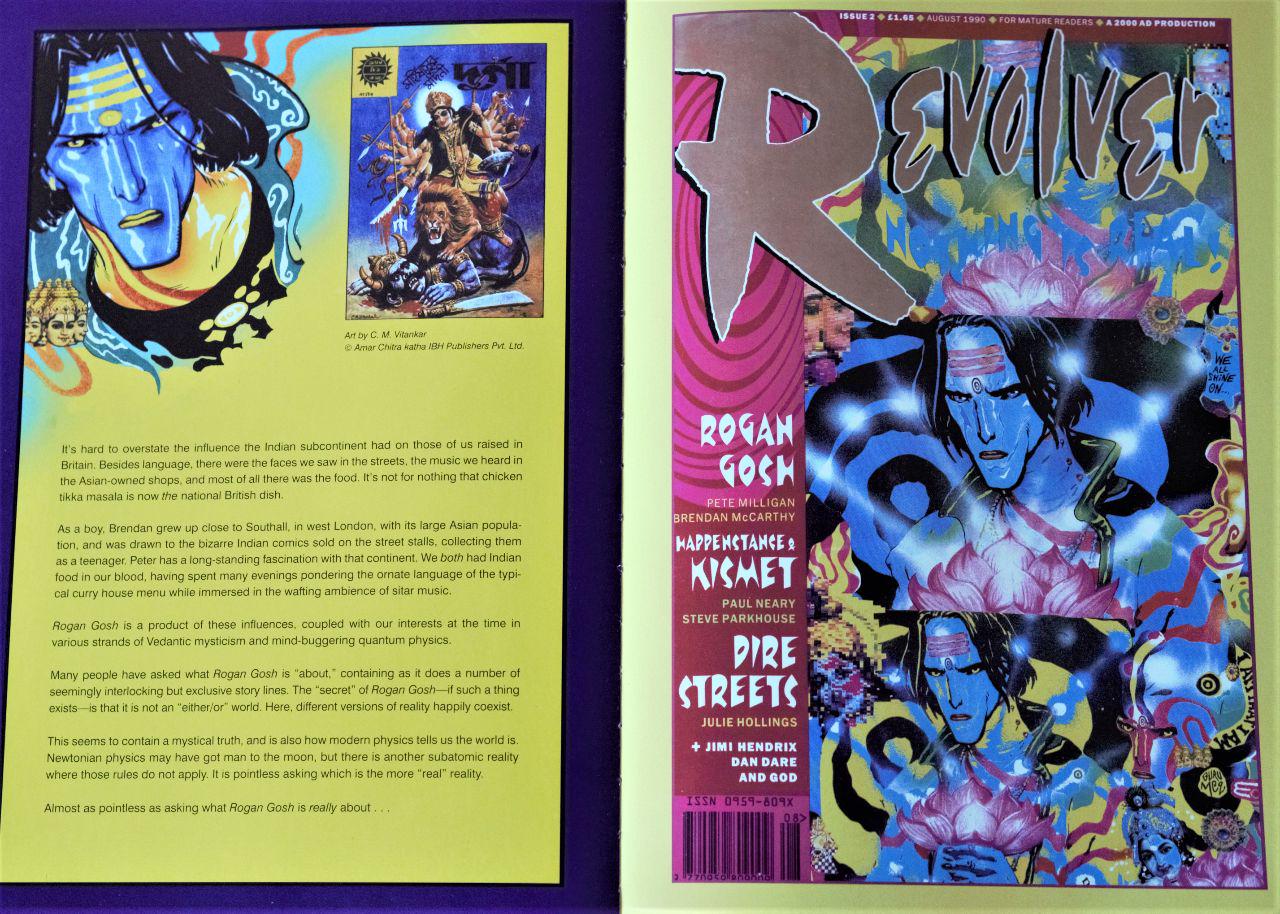
About a year ago, I listened to an interview with Neil Gaiman for the British Library podcast focused primarily on the RAMAYANA and Gaiman's involvement in adapting it for DreamWorks. When asked if he had a particular style in mind when working on the various [never-produced] treatments, Gaiman was quick to point out Brendan McCarthy's work on ROGAN GOSH, which Gaiman describes as being birthed from Brendan's “Road to Damascus moment, where he ran into a pile of comics in India, and just went 'I love this, there's art stuff here that I've never seen in the West,' and started doing stuff and playing with it.” He also goes on to describe ROGAN GOSH as “one of the most interesting moments of fusion between Indian and British and American comix culture.”

Naturally, I immediately looked into getting my hands on some ROGAN GOSH and discovered that it was reprinted in the pages of an over-sized hardcover titled THE BEST OF MILLIGAN & MCCARTHY published by Dark Horse Books in 2013 and retailing for only $24.99 (down to $7.19 as I type this). Although a horrendously produced edition (pages are actually falling out in less than a year since purchasing it), I'm still happy to have gotten my hands on it because it has been blowing my mind ever since. Not least because of the work itself, but because it simultaneously exposes a very vital almost secret history of comix lost to... I dunno,an obsession with the founding of Image Comics and the less than negligible work its founders produced? If there was ever a demented, revolutionary punk rock duo in comix, Milligan & McCarthy definitely fit the bill.

ROGAN GOSH first appeared in REVOLVER, a short-lived anthology magazine for mature readers published in the UK between 1990-1991. GOSH was finally collected by DC Comics/Vertigo into a 48-page one shot in 1994. It is perhaps because of the book's modest page-count that it is never mentioned in the same breath as say THE SANDMAN or PREACHER, or THE INVISIBLES or other long-running titles central to the Vertigo imprint's identity. But hey, Aristotle's POETICS is no more than a sodding 44 pages, which is sometimes all you need to jump-start a revolution.

In Milligan and McCarthy's own words, surrounded by “long and bloated 'concept album' comics”, they were more interested in “the short, sharp, throwaway pop single. The type you danced to. The type you had sex to.”

While the above statement can most be applied to their series PARADAX (also featured in the book), it pretty much hits the nail on the head with the majority of their collaborations, including ROGAN GOSH.

By the duo's own admission, it is not only difficult to describe what ROGAN GOSH is about, it is even pointless to ask. What may have been originally conceived as a “sci-fi Bollywood BLADE RUNNER” rapidly evolved into something far more demented. It starts off with Rudyard Kipling in Lahore en route to a place “where men of all castes come to sleep the sleep of dreams.” Essentially, an opium den where “karmanauts can relieve a man of the curses of his sins.” If you think that opening scene will give you any idea of what follows, you are sorely mistaken. Kupling is entered into a “jasmine-scented dream of the future” where we are transported to psychadelic trip after psychadelic trip involving completely different characters:

  • A man named Raju Dhawan waiting on another named Dean Cripps at a Tandoori joint called “Star of the East”
  • The blue-skinned Rogan Gosh on the run from the “bloody-tongued, dark destroyer” Kali together with a small idol of Kipling.
  • Raju Ghawan as Rogan Gosh together with Dean Cripps on the run from robotic hindu “Karma Kops”.
  • Rogan Gosh as a bull-riding ancient Egyptian cowboy of the future, roaming through the mythic land of Wild Bill Osiris and Horus Thuh Kid.

If none of this makes the slightest bit of coherence, well that's because there is nothing coherent about it. Rather than there being any kind of train of thought, it's more like a train blown to bits upon the detonation of atomic dynamite. Shards of ideas floating around a nebula, jabbing into each other with every turn of the page. It's bizarre stuff, heavy on logic-defying captions almost as much as the explosive visuals. If you, the reader, let yourself go, you'll find that the synergy of text and image in ROGAN GOSH will drag you around a strong relentless current of spicy thought soup. Washing ashore an island of utter confusion is inevitable, but not without a sense of thrill retained from the memories of the surrealist storm that was.

Imagine a comicbook operating along the logic of say, PROMETHEA, 8 years prior to PROMETHEA's publication and without any of the rigorous explanation of the world's mechanics the way PROMETHEA delves into. Instead you're just thrown into it and left to make connections entirely on your own. That's what ROGAN GOSH feels like; a weird transcendental spell cast in comicbook form.

It isn't a coincidence that Milligan & McCarthy share something with Alan Moore other than British citizenship. All three after all did get their start making comix in the indie music paper SOUNDS. Moore with ROSCOE MOSCOW in 1979, and McCarthy et Milligan with THE ELECTRIC HOAX in 1978. This discovery, although new to me, was not at all surprising, as I find that I am typically drawn to creators who cut their teeth in avenues that fall outside of “the mainstream”. Where the ones “in charge” understand little about what they’re doing, where anything goes and opportunities for mad experimentalism aren't stifled.

The greatest discovery in THE BEST OF MILLIGAN & MCCARTHY for me has been the duo's work on FREAKWAVE, a comic that, by Brendan's own admission, was directly inspired by MAD MAX 2: THE ROAD WARRIOR which Brendan became obsessed with during his surfing getaway in Australia in 1981. After which Brendan coerced Milligan to co-write a “Mad Max goes surfing” treatment Brendan could pitch to Hollywood. Hollywood didn't bite, but the duo did get to produce it as a backup strip in the pages of VANGUARD ILLUSTRATED published by Pacific Comics in 1983. Pretty straight adventure story initially (well, as straight as Milligan & McCarthy can muster anyway), with the most striking aspect of the strip being character designs and world building.

FREAKWAVE is a post-apocalyptic punk-rock drifter who windsurfs a flooded Earth in search of floating trash he can live off. He battles it out with disease-ridden humanoid “Water-rats” and psychopaths in gasmasks wrapped in old tin cans and the random cultural ephemera of old. FREAKWAVE would later resurface as a punk-absurdist Tibetan Book-of-the-Dead story in 1984's STRANGE DAYS, an anthology showcasing the work of Milligan, McCarthy, and Brett Ewans published by Eclipse Comics. It only ran for 3 issues, but Warren Ellis says it “landed like a hand grenade from another world”, which is still exactly what it feels like going through its contents 34 years later today. It is especially in the pages of STRANGE DAYS' feature comic FREAKWAVE that you see Brendan McCarthy and Peter Milligan really rocking out like some kind of alternative comicbook band, the pages crackling with the energetic buzz of an electric guitar. Brendan especially reaches peak McCarthiasm, with 90% of his visionary work on FURY ROAD appearing here first on the page a good 31 years before blowing people's minds on screen.

Which, by the way, how fucking cool is that? To be asked to work on the sequel to a film that inspired your scarcely read comicbook. And to be asked specifically because of your work on said comicbook?

Not to mention that FREAKWAVE, although given a pass by executives in Hollywood, very likely influenced the movie WATERWORLD in 1995, at the very least in terms of look and production design, which let's face it was the only really good thing about the film.

Nothing will give you that good kick in the balls to go off and make comix (or any ill-advised pursuit) more than looking at the work of Milligan and McCarthy. If a big part of the draw of comix for you is that it is medium void of filters between creator and reader, well then that cannot be more true of Milligan and McCarthy's collaborations. Because there are always editors keeping creators in check, or heck, even self-inflicted inhibition on the creator’s part. Not for Milligan and McCarthy.

Never for Milligan and McCarthy.

[Buy]

Ganzeer November 23, 2018

#comix

by Cristina Gallego, Ciro Guerra, Maria Camila Arias, Jacques Toulemonde Vidal (& various) o-o-o-o

BIRDS OF PASSAGE is a crime movie that does not feel like a crime movie. Chronicling a Wayuu family’s rise to power by way of illicit drug & arms dealing prior to their fall from grace and the inevitable disintegration that follows, the film serves as more of a window unto rural Wayuu culture in the seldom seen highlands of Columbia. The crime plot here isn’t the main attractor, but rather a narrative vehicle used to explore the Wayuu way of life, crime involved or not. Special attention is given to the depiction of unique Wayuu marriage ceremonies, burial rituals, the interpretation of dreams, and the passing down of ancestral stories. All this makes the film feel more like an anthropological documentary than your regular run-of-the-mill crime yarn, yet it is the crime yarn that serves to propel the narrative forward in a way anthropological documentaries seldom can.

In that sense, a lot of the film’s DNA seems to stem from Third Cinema, in that a fictional story is being delivered through an all too real, very-documentary-like package. Where it veers from standard Third Cinema is in its motive: It doesn’t exist as a critique of capitalist bosses in favor of the masses, nor as a critique of the colonizer in favor of the colonized. It simply serves to highlight the unique qualities of a culture far removed from where cinema is typically made, and in so doing it highlights the thing that makes us special as a species. Even if we all end up killing each other in the end.

Ganzeer November 9, 2018

#film

Enter your email to subscribe to updates.