G A N Z E E R . R E V I E W S

comix

by Chris Ware o-o-o-o-o

The Acme Novelty Library #20 (which you wouldn’t know was The Acme Novelty Library #20, not right away, not on first glance) sat on my shelf for about 5 years, and traveled with me between 4 different cities before finally being read. Not because it’s big or daunting in any way, but because of perhaps the tedious demeanor implied by its unique Chris-Ware-ness; the four panels that detail a character’s fall off a bike, the five panels (some of them very small) that detail the picking of a pimple, the drip-drip of a ceiling leak into a bucket. But these are the very same reasons you’d keep the book around. Over the course of consecutive moves, you’d cleanse your life of the weight of numerous books, but not this one despite not having bothered to read it not once. But every once in a while, when you do pick it up, and you do flip through it, the magic of its storytelling mechanisms are obvious enough for you to keep it around. You know, even without reading it, that it is a true work of art, and as such should stay.

When I did finally read it, I read it in one sitting and I was so very glad that I never got rid of it. Simply put, it is a work of genius.

The book focuses on the life of a single individual; Jordan Wellington Lint, from the moment of birth all the way to the time of his death as an elderly man. For this reason, Ware has ingeniously designed the book to resemble a photo album with the family name stamped on the front in gold foil. No sign that it is part of the Acme Novelty Library, and not even any sign of the author’s name. Even the spine displays only the name Jordan Wellington Lint, whose life the album covers.

The book is a character study, and the character it studies isn’t the most pleasant of people. By the time he’s in his teens, he’s a bully. In his twenties he’s a slacker. He finds Christ at some point, considers himself to have turned his life around to become a model citizen, but he actually isn’t because he’s a terrible cheat. Not to mention racist. Not overtly so, but subtly in the way most White Americans who don’t think of themselves as racist actually are.

It’s not a very easy book in that it’s heartbreaking. It’s heartbreaking to see the decisions this Jordan Lint is making, his fucking up so bad, his falling victim to his own weaknesses. But its hardest part might be in its ability to hold up a mirror to the reader and bring about deep hidden memories of one’s own fuck-ups, one’s own failures, one’s own moments of weakness.

Needless to say, Chris Ware as per his usual employs a wide array of composition and storytelling techniques that will keep you coming back to the book for study and reexamination. It is a masterclass of more things than one, and a major landmark in the history of graphic storytelling, all in just 72 pages.

Highly recommended.

[Buy]

#comix

by Peter Milligan and Brendan McCarthy o-o-o-c

Madness. Sheer and utter madness.

I must admit that before MAD MAX: FURY ROAD, I hadn't even heard of Brendan McCarthy, which is a damn inexcusable shame. But to be fair, the work of Milligan & McCarthy hasn’t really been part of the dialogue in comix culture. Not even when it comes to talking about the impactful indie work that fell outside of the mainstream; you never hear their work cited alongside that of Frank Miller's SIN CITY (which, before the 2005 film release was only really known in pretty small circles throughout the 1990's) or Eddie Campbell's ALEC or Dave Sim's CEREBUS. But that silence is in no way reflective of the duo's influence.

About a year ago, I listened to an interview with Neil Gaiman for the British Library podcast focused primarily on the RAMAYANA and Gaiman's involvement in adapting it for DreamWorks. When asked if he had a particular style in mind when working on the various [never-produced] treatments, Gaiman was quick to point out Brendan McCarthy's work on ROGAN GOSH, which Gaiman describes as being birthed from Brendan's “Road to Damascus moment, where he ran into a pile of comics in India, and just went 'I love this, there's art stuff here that I've never seen in the West,' and started doing stuff and playing with it.” He also goes on to describe ROGAN GOSH as “one of the most interesting moments of fusion between Indian and British and American comix culture.”

Naturally, I immediately looked into getting my hands on some ROGAN GOSH and discovered that it was reprinted in the pages of an over-sized hardcover titled THE BEST OF MILLIGAN & MCCARTHY published by Dark Horse Books in 2013 and retailing for only $24.99 (down to $7.19 as I type this). Although a horrendously produced edition (pages are actually falling out in less than a year since purchasing it), I'm still happy to have gotten my hands on it because it has been blowing my mind ever since. Not least because of the work itself, but because it simultaneously exposes a very vital almost secret history of comix lost to... I dunno,an obsession with the founding of Image Comics and the less than negligible work its founders produced? If there was ever a demented, revolutionary punk rock duo in comix, Milligan & McCarthy definitely fit the bill.

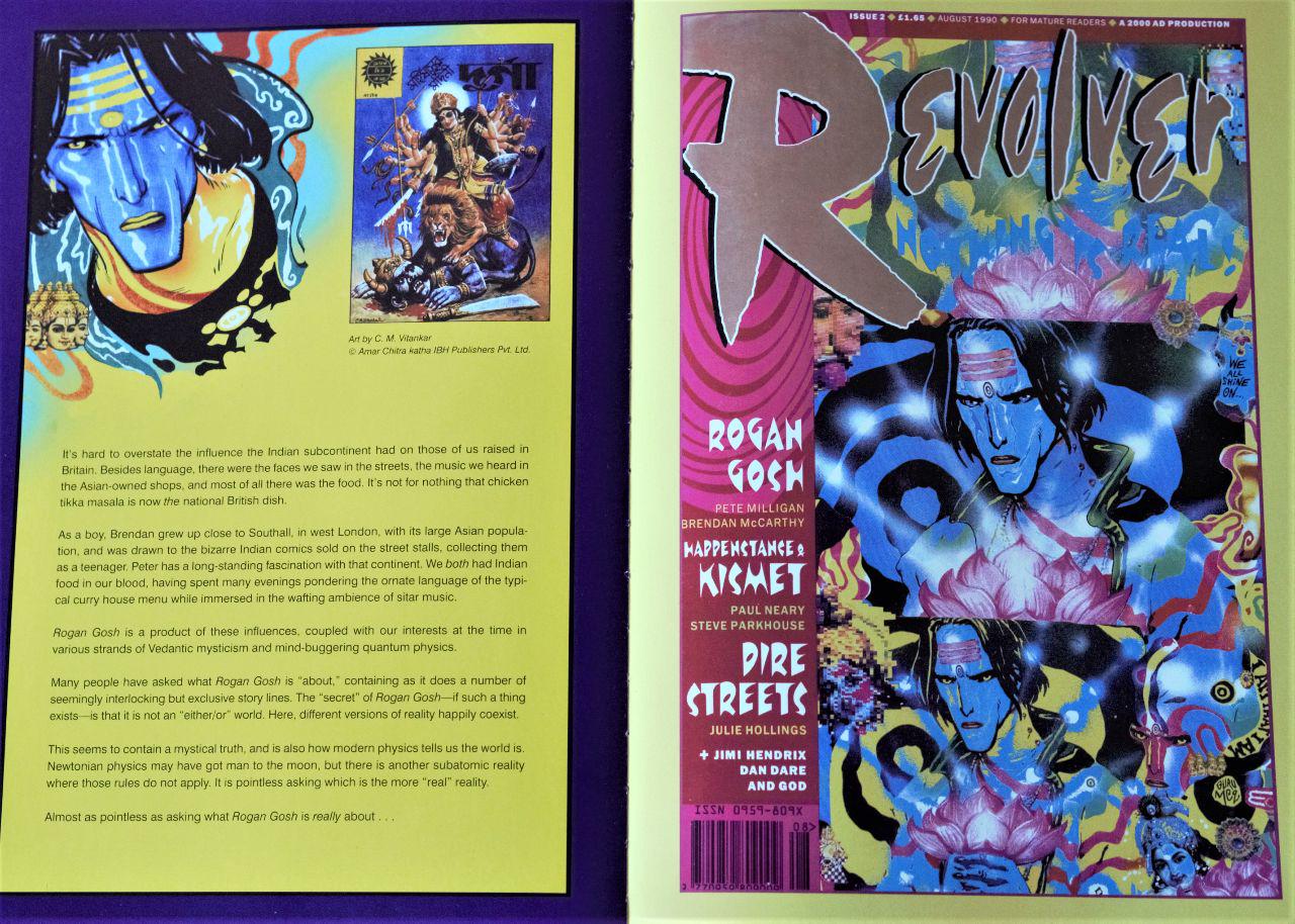
ROGAN GOSH first appeared in REVOLVER, a short-lived anthology magazine for mature readers published in the UK between 1990-1991. GOSH was finally collected by DC Comics/Vertigo into a 48-page one shot in 1994. It is perhaps because of the book's modest page-count that it is never mentioned in the same breath as say THE SANDMAN or PREACHER, or THE INVISIBLES or other long-running titles central to the Vertigo imprint's identity. But hey, Aristotle's POETICS is no more than a sodding 44 pages, which is sometimes all you need to jump-start a revolution.

In Milligan and McCarthy's own words, surrounded by “long and bloated 'concept album' comics”, they were more interested in “the short, sharp, throwaway pop single. The type you danced to. The type you had sex to.”

While the above statement can most be applied to their series PARADAX (also featured in the book), it pretty much hits the nail on the head with the majority of their collaborations, including ROGAN GOSH.

By the duo's own admission, it is not only difficult to describe what ROGAN GOSH is about, it is even pointless to ask. What may have been originally conceived as a “sci-fi Bollywood BLADE RUNNER” rapidly evolved into something far more demented. It starts off with Rudyard Kipling in Lahore en route to a place “where men of all castes come to sleep the sleep of dreams.” Essentially, an opium den where “karmanauts can relieve a man of the curses of his sins.” If you think that opening scene will give you any idea of what follows, you are sorely mistaken. Kupling is entered into a “jasmine-scented dream of the future” where we are transported to psychadelic trip after psychadelic trip involving completely different characters:

  • A man named Raju Dhawan waiting on another named Dean Cripps at a Tandoori joint called “Star of the East”
  • The blue-skinned Rogan Gosh on the run from the “bloody-tongued, dark destroyer” Kali together with a small idol of Kipling.
  • Raju Ghawan as Rogan Gosh together with Dean Cripps on the run from robotic hindu “Karma Kops”.
  • Rogan Gosh as a bull-riding ancient Egyptian cowboy of the future, roaming through the mythic land of Wild Bill Osiris and Horus Thuh Kid.

If none of this makes the slightest bit of coherence, well that's because there is nothing coherent about it. Rather than there being any kind of train of thought, it's more like a train blown to bits upon the detonation of atomic dynamite. Shards of ideas floating around a nebula, jabbing into each other with every turn of the page. It's bizarre stuff, heavy on logic-defying captions almost as much as the explosive visuals. If you, the reader, let yourself go, you'll find that the synergy of text and image in ROGAN GOSH will drag you around a strong relentless current of spicy thought soup. Washing ashore an island of utter confusion is inevitable, but not without a sense of thrill retained from the memories of the surrealist storm that was.

Imagine a comicbook operating along the logic of say, PROMETHEA, 8 years prior to PROMETHEA's publication and without any of the rigorous explanation of the world's mechanics the way PROMETHEA delves into. Instead you're just thrown into it and left to make connections entirely on your own. That's what ROGAN GOSH feels like; a weird transcendental spell cast in comicbook form.

It isn't a coincidence that Milligan & McCarthy share something with Alan Moore other than British citizenship. All three after all did get their start making comix in the indie music paper SOUNDS. Moore with ROSCOE MOSCOW in 1979, and McCarthy et Milligan with THE ELECTRIC HOAX in 1978. This discovery, although new to me, was not at all surprising, as I find that I am typically drawn to creators who cut their teeth in avenues that fall outside of “the mainstream”. Where the ones “in charge” understand little about what they’re doing, where anything goes and opportunities for mad experimentalism aren't stifled.

The greatest discovery in THE BEST OF MILLIGAN & MCCARTHY for me has been the duo's work on FREAKWAVE, a comic that, by Brendan's own admission, was directly inspired by MAD MAX 2: THE ROAD WARRIOR which Brendan became obsessed with during his surfing getaway in Australia in 1981. After which Brendan coerced Milligan to co-write a “Mad Max goes surfing” treatment Brendan could pitch to Hollywood. Hollywood didn't bite, but the duo did get to produce it as a backup strip in the pages of VANGUARD ILLUSTRATED published by Pacific Comics in 1983. Pretty straight adventure story initially (well, as straight as Milligan & McCarthy can muster anyway), with the most striking aspect of the strip being character designs and world building.

FREAKWAVE is a post-apocalyptic punk-rock drifter who windsurfs a flooded Earth in search of floating trash he can live off. He battles it out with disease-ridden humanoid “Water-rats” and psychopaths in gasmasks wrapped in old tin cans and the random cultural ephemera of old. FREAKWAVE would later resurface as a punk-absurdist Tibetan Book-of-the-Dead story in 1984's STRANGE DAYS, an anthology showcasing the work of Milligan, McCarthy, and Brett Ewans published by Eclipse Comics. It only ran for 3 issues, but Warren Ellis says it “landed like a hand grenade from another world”, which is still exactly what it feels like going through its contents 34 years later today. It is especially in the pages of STRANGE DAYS' feature comic FREAKWAVE that you see Brendan McCarthy and Peter Milligan really rocking out like some kind of alternative comicbook band, the pages crackling with the energetic buzz of an electric guitar. Brendan especially reaches peak McCarthiasm, with 90% of his visionary work on FURY ROAD appearing here first on the page a good 31 years before blowing people's minds on screen.

Which, by the way, how fucking cool is that? To be asked to work on the sequel to a film that inspired your scarcely read comicbook. And to be asked specifically because of your work on said comicbook?

Not to mention that FREAKWAVE, although given a pass by executives in Hollywood, very likely influenced the movie WATERWORLD in 1995, at the very least in terms of look and production design, which let's face it was the only really good thing about the film.

Nothing will give you that good kick in the balls to go off and make comix (or any ill-advised pursuit) more than looking at the work of Milligan and McCarthy. If a big part of the draw of comix for you is that it is medium void of filters between creator and reader, well then that cannot be more true of Milligan and McCarthy's collaborations. Because there are always editors keeping creators in check, or heck, even self-inflicted inhibition on the creator’s part. Not for Milligan and McCarthy.

Never for Milligan and McCarthy.

[Buy]

Ganzeer November 23, 2018

#comix

by Archie Goodwin and Walter Simonson o-o-o-o

One of the best exercises in plotting I've ever seen came in a comicbook I don't think I'd normally be interested in picking up: MANHUNTER.

Yes, it has the names of Archie Goodwin and Walter Simonson on the cover, but it's a comicbook called Manhunter for Christ's sake. Look at what this supposedly fearsome Manhunter is wearing, my God. But, Warren urged me to check it out and I have never been disappointed by a Warren Ellis recommendation to date.

Lessons learned from this slim collection are numerous. First of all, it is an absolute joy to read! Which was such a breath of fresh air because more than once in the past few months have I found myself dropping a book out of sheer boredom. MANHUNTER will engage you from start to finish. I started reading it one night before bed, and found myself finishing it the next morning over cereal at the kitchen table, almost unable to put it down. Now if that ain't good storytelling, I don't know what is. As far as escapist fiction goes, forget DOC SAVAGE, or heck Michael Moorcock's ELRIC novels even (blasphemy, I know), but your blueprint for good ol' fashioned escapism is right here, because what Archie Goodwin did with this is pretty much toss in every pulpy plot trick known to man. Clones? You bet. Moles? Check. Conspiracy? Check. Super-healing? Check. Suspended Animation? Check. Teleportation? Yup. Mind-controlled machines? Oh yeah. Betrayal? Of course.

The book has it all, but what's most impressive is how it was all fit into such a slim package. Before it was collected into this 72-page edition in 1984, MANHUNTER ran as an 8-page backup story, serialized in a 1973 run of DETECTIVE, who's lead character was Batman. Sales were low, and the title needed spicing up, but Goodwin realized that he couldn't get away with doing anything too radical on the Batman. A backup story starring an unknown character, on the other hand, he could play with. A whiff of editorial genius pushed him to tap into the then young Walt Simonson, who did with Goodwin's loose plots some really groundbreaking work. If, like me, the notion of drawing or writing a 9-panel grid has ever brought about a feeling of dread, MANHUNTER is your remedy because Simonson will sometimes do a 13-panel page, and it will look beautiful, designed. The storytelling is clear, natural, and effortless. Somehow, the 9-panel grid looks like a walk in the park after studying Simonson's work on MANHUNTER.

Goodwin started out writing “Marvel style” on these with Simonson. Essentially, rather than giving Simonson full scripts, he gave him plots. Walt would then take these plots and use them to rough up his page layouts, which Goodwin would then use to work in dialogue and captions. Such was the collaborative nature of this thing that by the 3rd or 4th episode, Goodwin no longer wrote the plots and instead just talked them out with Simonson. Ideas bounced back and forth between them with such excitement that you can actually feel it reading the comicbook.

Sure, it's rather hoaky in many parts, but it's good hoaky. And in a very short amount of time you somehow find yourself growing rather fond of this ridiculously dressed man who calls himself Manhunter. His adventures take him from Nepal to Marakech to Istanbul, Japan, and Nairobi. It's rather genre defying in that it's part spy thriller, part detective mystery, part super-hero adventure. All of this in 8-page episodes! I don't recall ever seeing that before. A true masterclass in condensed adventure-storytelling.

Now, everything I've mentioned so far is evident of MANHUNTER being made up of a great deal of plot, and nothing much else, which goes against my argument for “sly escapism”. And I think that towards the last episode when it came time to end the story, Archie Goodwin realized that if his story didn't have some kind of point to it, then all the amazing plotting he'd conjured up would amount to absolutely nothing. So he gave it a point and it's a really good one [spoiler alerts are for pansies]. He made it a story against the idea of resurrection and prolonging of life. A story about accepting death when it is time to die. I may be giving this fun little adventure tale more depth than it calls for, and I fully acknowledge that there's no way in hell this comicbook will interest anybody not already interested in comicbooks about costumed superheroes. It definitely doesn't transcend the genre in the way something like, say, WATCHMEN does, but you can be sure that Alan Moore and Dave Gibbons were informed by the storytelling techniques employed in MANHUNTER if nothing else.

#comix

by Walter Simonson o-o-o-o

Warren Ellis insisted I read this after noticing stylistic similarities in my work on THE SOLAR GRID. I'll admit, this isn't something I would've necessarily been attracted to, not at first glance, as I tend to lean more towards science fiction that has its roots more in science rather than fantasy, but it only took me the first few pages to understand why Warren would recommend this. STAR SLAMMERS is a masterclass in comicbook storytelling.

Now, for the B-movie aficionados, it might disappoint you to know that this has nothing whatsoever to do with the movie STAR SLAMMER: THE ESCAPE (previously released as PRISON SHIP), but I guarantee you it is much better.

It blows my mind that this is Simonsons' first ever comix work, because it has all the hallmarks of a seasoned professional, one who knows the medium like the back of his hand. Although, with enough enthusiasm for it to bend the rules from time to time and experiment with storytelling techniques. One of my favorite parts in the book is when Senator Krellik (the bad guy) asks the delegates of his planet to vote on whether or not to eradicate the Slammers, effectively an act of genocide. Monolithic holograms take form behind him, a rose for life, a skull for death. The votes are cast, and it's as if the skull awakes.

Now what's interesting is that this warmongering democracy is not brought to its knees by way of a lone warrior, but rather a collaborative tactic that requires a level of elevated spirituality. Sure, it isn't the most groundbreaking story, but it's beautiful stuff. And it feels like a full fledged movie, told almost effortlessly in just 64 pages. I find myself referring to it over and over again just to learn how to pull that off (once I bring THE SOLAR GRID to a close, I don't think I'll be able to handle a project of the same scope for quite a while).

“Genre-bending” is the new buzz word de jour, but STAR SLAMMERS, first published in the WSFA Journal in the early 70's, and later reprinted in 1983 by Marvel, has its fair share of it with elements drawn from sci-fi, fantasy, westerns, and samurai cinema. While the story will hardly blow anyone away, especially not today, the book is an exemplar manual in conscious and powerful graphic storytelling, not to mention illustration in general.

STAR SLAMMERS is available used on Amazon for as low as $0.99

In 2014, IDW released a poorly marketed re-release of STAR SLAMMERS, complete with a sequel that, once upon a time, was partially released by Malibu Comics in 1994. Based on the previews, this new collected edition seems to have been “re-mastered” with 90's era digital coloring that I just can't swallow. But do pick it up if that's more your jam.

#comix

by John Pham o-o-o-c

I have a soft spot for beautiful print objects and well-designed zines. I envy comicbook auteurs the likes of Adrian Tomine and Daniel Clowes, who are masters of both art and story. And boy do I get off on experimentation with format. John Pham pulls that all off in his beautiful self-published anthology series EPOXY.

The first issue, published in 2000, is without a doubt, the least experimental of the bunch, at least as far as production goes. Comprised of 64 pages printed in black & white, wrapped in 4-color cover, it doesn't feel like anything out of the ordinary, until you read the the stories within. The first story, SHIVA, involves a humanoid robot on the run from a flying dragon in a futuristic version of the Vietnamese city of Hue.

The second story, ELEPHANTINE, is about a one armed boxer who cannot be beat, until maybe something happens to his corner-man. The third story, MODESTO, sandwiched between the other two, is more of a traditional slice-of-life story about the shenanigans of a teenage Vietnamese-American girl who has a big family reunion dinner party to look forward to.

For EPOXY's second issue, Pham opts for a smaller zine-like cut, but ups his production game with a risograph print. A two-color beaut for the cover, and a close-to-florescent green for the interiors. Both ELEPHANTINE and MODESTO continue where they left off, but SHIVA is oddly nowhere to be found.

Enter issue #3, which is the size of a book in its own right, with spine and everything. The format larger than the previous two, and took Pham two years to produce. In it, he concludes SHIVA. And halfway through the book, he introduces another story, ASTROGIRL, done in a style that is somewhat akin to Chris Ware's work.

With issue #4 and #5, John Pham takes his work into a completely new direction like nothing I've seen in comix. Both are printed on a risograph, and John really takes advantage of what he can do with the machine with just 2-3 colors, getting grains of blues and oranges and pinks to mix in fresh interesting ways. The result is something that can only be produced on a risograph and no other way.

The main storyline is called DEEP SPACE, an avant-garde sci-fi piece about a traveler landing on a weird planet.

Also inside the issue are two miniature magazines actually stapled inside. One of them is a funny mini-comic titled JAY & KAY, and the other a satirical magazine called COOL MAGAZINE, filled with miniature crossword puzzles, fake interviews and product reviews.

With these last two issues, Pham really elevates his practice to create something much closer to fine art than comicbooks. The way the three original stories came to an end feels somewhat abrupt, but it doesn't take away from joy of experiencing them. Not entirely unlike say, Daniel Clowes' GHOST WORLD. Although, if I'm completely honest with myself, my reason for following John Pham in the future will not necessarily be his stories, but rather for his storytelling, and how he makes use of illustration, design, and printmaking to such superb effect, which is such a rarity in most comix these days.

[Buy]

#comix

By Matt Sheean and Malachi Ward o-o-o-o-o

A perfect blueprint for creating condensed high-concept pieces tailored specifically to the comix medium is Matt Sheean and Malachi Ward's ANCESTOR.

Wealthy inventor/entrepreneur Patrick Whiteside throws a big party at his estate for a number of special people he has chosen to be exposed to “the vaults of the universe.” Little do the party-goers know, they will very soon be responsible for remaking the entire universe, even if they don't really want to.

At least some of them, anyway.

In just 4 short chapters, this work of art by Sheean and Ward will take you where you will never expect. By the time you close the back cover, you'll feel something akin to coming off of an acid trip, mind-expansion and all.

It's an odd, understated book that has more of an arthouse feel than anything Image Comics has ever put out (love the paper!). Beautifully designed, lettered, and produced and very well thought out, to the point where the gutters between the panels are a pale pinkish color at the beginning of the book, gradually getting darker as the story progresses. Sheean and Ward have thought of everything.

I imagine I'll be following everything they make from here on out.

[Buy]

#comix

By Steranko o-o-o-c

Steranko, of course, is a magician. No, but really. He spent many childhood summers with his old man, who had his own magic act, doing circuses and carnivals until he became a side-show performer himself. By his late teens, he had already reaped a wealth of newspaper and TV publicity as an escape artist. This, I believe, may have helped hone Steranko's special talent at seeing through the mechanisms of how things work. This can be seen in every facet that makes up this pocket-sized novella from 1976. This, however, does not necessarily benefit the story as much as it benefits the rather ingenious visuals, design, and packaging of CHANDLER.

It is precisely because Steranko sees right through the mechanism of noir stories that CHANDLER is a wholly unoriginal run-of-the-mill crime noir tale with plenty of cheese. Where Steranko truly delivers, in my opinion, is in everything else: Crisp and beautifully composed and rendered full-color artwork. An ingenious grid format that gives the storytelling a beautifully steady pace and a very comfortable reading experience that a great many illustrated novels tend to lack, and a modern type treatment that is impeccably considered. It would be unfair to describe CHANDLER as an illustrated novella, because what illustrated novella features two illustrations per page? The illustrations and design of the entire thing are an in integral part of the storytelling experience, which makes CHANDLER far more than an illustrated novel but not quite a graphic novel either. It is a wholly unique experience, where Steranko sticks to 13 lines per column which deliberately correspond to a vertical panel right above. It is a work of illustration and design genius. And even if one was to throw away the story, the design, and just fixate on the panels, it's easy to imagine each and every one of them hanging in the MOMA or MAD completely on its own.

Fans of Steranko's art might be fooled into thinking the larger “deluxe” edition of this book is more worthy of their bookshelf space, but if you really want to experience CHANDLER the way Steranko's design solutions were intended for, then Pyramid's pocket-sized “pulp” edition is the only way to go.

And while I may not be entirely impressed by the story, I cannot possibly imagine Steranko creating the images without simultaneously writing the story for them, nor could I imagine him writing the story without simultaneously considering the artwork and design. Pulling something like CHANDLER off requires something of the cognitive abilities of a drummer, which I've discovered that Steranko also excelled at.

My brain now growls for more Steranko, and so should yours.

P.S. The story was later reprinted and repackaged as CHANDLER: RED TIDE.

#comix #prose

By Taiyo Matsumoto o-o-o-o

TEKKONKINKREET is kind of amazing. On first glance, it's not something I would normally pick up, but Ales Kot shoved it my face for my birthday, and my psyche is all the better for it. Manga can be weird, but TEKKONKINKREET is weird even by manga's standards. It doesn't adhere to any industry criteria, neither in terms of story or art. It feels very, shall we say, indie, very ziney, but 600 pages of ziney art and story rather than the handful of pages we're used to from most zines. It's Japan's answer to the underground comix of 60's-70's America.

The line-art is somewhat wobbly, and feels like Matsumoto took a ballpoint pen directly to the paper, sans penciling or any kind pre-planning. This may seem somewhat off-putting at first, but after a couple of pages, it really grows on you and clings to your heart and becomes an inseparable part of TEKKONKINKREET's charm. If I were to reveal the plot to you, you would automatically decree that its a story that should take no more than 150 pages tops, but part of the reason it takes 600 is that Matsumoto allows certain moments to breathe. Something that would take no more than 2 panels in your average Western comicbook, Matsumoto uses an entire page of 7 panels for. This allows certain moments to sink in, be felt, and really helps put you in the story's setting.

TEKKONKINKREET is definitely an outlier, where common wisdom would dictate it should not really exist. If it were pitched, no one would publish it. It's a whimsical, pure, unfiltered passionate output that can only exist in this world by the sheer persistence of its creator, and as such is one of the most inspiring and fulfilling graphic novels you will ever read. Nothing will make you want to make comix –or anything for that matter– quite like TEKKONKINKREET will.

Now I'm jonzing to see the film.

[Buy]

#comix

By Ales Kot, Will Tempest, Clayton Cowles, and Tom Muller o-o-o-o

Excellent comicbook for people who don't read comics. It's Kot's soapbox book, in the way that PROMETHEA was Alan Moore's and much of TRANSMETROPOLITAN was Warren Ellis'.

MATERIAL, Vol. 1 is different in that rather than follow one main character, it follows four: a former Guantanamo inmate, an actress, a protestor, and a philosophy professor. Their stories are not in anyway intertwined nor do they intersect at any point, but exist as parallels, and I quite like that. While each of our four characters leads a completely different life, what they share in common is perhaps this: something new is introduced in their lives. Whether that new thing is a positive influence or not entirely depends on what they do with it.

Upon first glance, Will Tempest's art may come off as rather weak, especially especially If you've become overly accustomed to Marvel/DC fare. Not unlike attempting to derive the flavors of a simple Italian oregano/olive oil dish of some kind after eating a deep fried chicken doused in barbecue sauce. Almost impossible. But Will Tempest's art is really really good for the purpose of MATERIAL and I love that he's taking his color cues from the principles of graphic design rather than animation or cgi. It's cleanliness and clarity is a breath of fresh air what with the mess that is mainstream comics now.

The book also includes a series of excellent essays by Spencer Ackerman, Fiona Duncan, Jarette Kobek, Sarah Nicole Prickette, and Bijan Stephen! Way to connect the book to a larger cultural dialogue, Ales!

There ought to be more “soapbox comics”, because the medium is so right for it. And if you think about it: the comic strip, which is the predecessor of the comicbook, is entirely a soapbox affair. The whole idea behind the strip is for artists to use cartoon characters as vessels for their thoughts and frustrations on a daily basis. Why that approach is virtually absent from the comicbook, I think, has much to do with publishers trying to act too much like TV producers: relying on synopses and treatments and anything else that will turn a story into a stiff unrisky mathematical equation. An environment that PEANUTS, CALVIN & HOBBES, AND LITTLE NEMO IN SLUMBERLAND can simply never thrive in. And you can bet that neither Ellis nor Moore would've been able to publish TRANSMET or PROMETHEA had they not already been household names. Although with Moore, PROMOTHEA started out as a superhero book, but turned into something else along the way, as per the Shaman's own testimony.

Kudos to IMAGE COMICS for growing the balls to publish MATERIAL, a book that relates to people not yet part of the company's usual readership. Now if there was only a way to get it on shelves outside of comicbook shops.

[Buy]

#comix