G A N Z E E R . R E V I E W S

comix

by Todd Hignite o-o-o-c

I'm of two very contradictory minds when it comes to this one. On one hand, it's a very important survey of America's most celebrated alternative cartoonists, and on the other hand it's kind of disappointing. Feelings of disappointment may pertain to me and me alone and may not in any way be objective in relation to the book's content at all. It probably has much to do with my expectations going into the book, expectations that manifested on the basis of the book's title (“In the Studio”). Was I wrong to expect at least a peek into these cartoonists' workspaces? Was I wrong to expect copious amounts of craft talk and process stuff? We end up getting neither, hence the severe feelings of disappointment I cannot seem to shake off. With that being said, we do get into the cartoonists' heads quite a bit, along with a looksee at upbringing and early influences, both of which I find wholly insightful. Hense, the book's importance. 
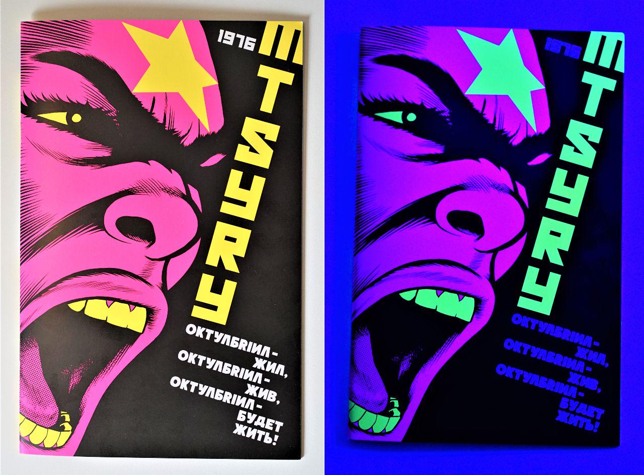
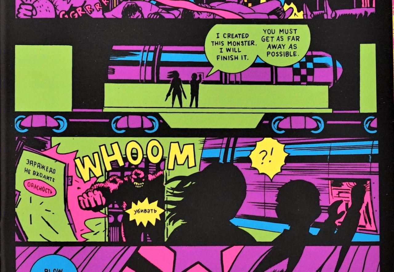
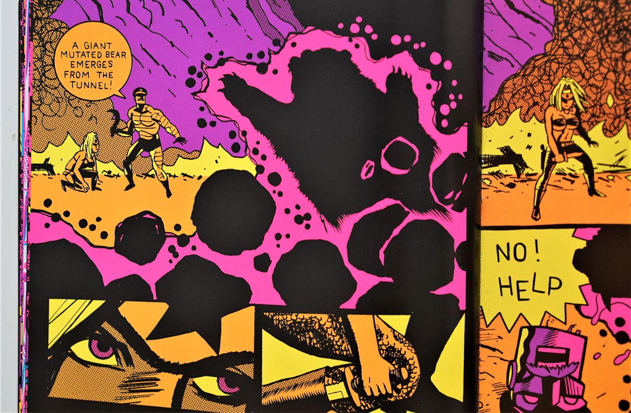
(please excuse the shit lighting on these pix)

The cartoonists in question are: Robert Crumb, Art Spiegelman, Gary Panter, Charles Burns, Jaime Hernandez, Daniel Clowes, Seth, Chris Ware, and Ivan Brunetti. So really, a who's who of the creme de la creme of working alternative cartoonists. If you know these artists' work well though, chances are none of the work by them featured and discussed in this here tome will offer any new insight. What this book does really well though is showcase all the material they cite as influences and allow them to talk about it at length, which very few interviews get to do. I've always been keen to look at the work that influenced my influences, so that aspect of the book I find to be wholly invaluable. Crumb talks at length about obscure working-class satire magazines dating back to the 1800s, along with early MAD and Carl Barks' Donald Duck comics and Thomas Nast's work for Harper Weekly. When you see his own work laid out next to those works, it really does begin to look like a natural mélange of the stuff. Spiegelman cites old Sunday strips, Harvey Kurtzman, art nouvea, Otto Nuckel's “picture novel” from the 1930's, and uncovering “weird” comic books like Fletcher Hanks' STARDUST. And it's like this for every cartoonist's profile, with pictured samples from all their influences (although sometimes the images can be quite small), so again: a truly invaluable survey in that particular regard.

But I'm still aghast that a book titled “in the studio” wouldn't include a single studio shot pertaining to any of the featured cartoonists. And virtually nothing whatsoever on their preferred tools and approach to making the stuff they make. Even when they do actually talk about the stuff they make, it's about theme and general circumstances and the stuff you might find in any interview surrounding the work but nothing whatsoever on the process of actually making it. Where exactly is the studio aspect of “in the studio”? Despite how invaluable the book is for other reasons, I still feel cheated. Had it been called “Conversations with Contemporary Cartoonists” or some such, I likely would've expected exactly what I got and been completely satisfied with it.

[Buy]

#prose #comix

Frank Miller and Dave Gibbons o-o-o-o-c

Rotterdam, 2008 — I was an artist-in-residence at Stichting B.a.d, where one of the residents and founding members was also a reader of comicbooks. Taking note of my interest in the form, the fellow showed up one day with what he said was his favorite graphic novel of all time. It was credited to Frank Miller and Dave Gibbons on the cover, both names I instantly recognized, but the title was one I'd never heard of: GIVE ME LIBERTY. Despite much being written about both authors and their oeuvre, this one seems to have slipped through the cracks somehow. At least as far as my reading pertained. Upon reading it, I really couldn't understand why this work wasn't at the very top of reading lists everywhere alongside works like WATCHMEN and [the very overrated] DARK KNIGHT RETURNS because right then and there it probably made it somewhere in my top five list (I'm really bad at ranking). I recently decided to give it a reread and was thoroughly surprised how influential it's been on me from that one initial read alone. So much so that I could see how it might've insidiously informed some of the DNA that went into my own THE SOLAR GRID. But personal influence aside, I would regard GIVE ME LIBERTY to be the absolute finest writing by Frank Miller, with the work of Gibbons being right up there with his work on WATCHMEN if not a hair or two better even (only because it's really hard to top). And I say better because Gibbons is able to do some wonderful things with page layouts in relation to storytelling that he couldn't at all do within the confines of WATCHMEN's nine-panel-grid. Which of course was essential to WATCHMEN's narrative, and which indeed Gibbons was able to make sing in ways no one can, but reading GIVE ME LIBERTY makes it clear that Gibbons might've been somewhat shackled by the grid (who wouldn't?). He really goes all out with pages that are as beautiful as they are effective.

The book is divided into four parts in a format not so dissimilar from Dark Knight Returns. If ever there was a thinly veiled critique of Reaganomics in comix form, Part 1: Homes & Gardens would most certainly fit the bill. It kicks off with the birth of Martha Washington in “The Green”, an enclosed lower income housing facility that is akin to a city within a city, somewhat along the lines of Kowloon Walled City or the Jewish ghettos orchestrated by Nazi Germany. In fact, the latter example is more apt given that The Green is heavily guarded and enclosed by barbed wire. President Rexall is voted into office for the first time a year later and the nation gradually slips into fascist dictatorship over the course of the next 13 years. Yes, you read that right, 13 years because Rexall manages to repeal the 22nd Amendment. This is communicated in one of the most efficient strokes I've ever seen utilized in graphic storytelling.

Ever since WATCHMEN introduced the use of non-comix worldbuilding backmatter in 1986, we've seen this sort of thing pop up in other works from time to time (THE SURROGATES by Venditti and Weldele published as late as 2006 comes to mind) but GIVE ME LIBERTY may just be the first to have that sort of thing sprinkled throughout the narrative rather than exclusively at the very end. This gives its impact an entirely different effect, because the timing of the information introduced by this stuff in the relation to the usual comix narrative makes all the difference in the world. I honestly thought I was being new and inventive by doing the same in the pages of THE SOLAR GRID, having entirely forgotten that I'd seen it done before! Like I said, GIVE ME LIBERTY is so clearly baked into the DNA of my work in ways that are even surprising to me.

Martha eventually manages to make it out of The Green and join P.A.X. (The Peace Force for America) shortly after which is one of the most viscerally intense war scenes I've ever seen depicted in a comicbook. When Martha's sent out to join the front lines in Brazil for the first time. Holy shit. She's just dropped in the middle of the action with very little prep or explanation and its page after page of utter fuckery and confusion. Really intense shit.

Part 1 ends with the implication that Martha is due to become a decorated war hero, but not before playing ball with some very nasty people. Goodness, what a way to end, and talk about a transformative character arc in a mere 48 pages!

And if that weren't enough of a transformation, Part 2, titled Travel & Entertainment, takes Martha on a mission to outer fucking space! Now Miller's work almost always has a problematic edge to it: excessive machismo, blatant sexism, and what might be considered arguments in favor of fascist measures. What makes GIVE ME LIBERTY different though (and what made it shocking to me when Miller came out against Occupy Wallstreet with seething rage), is that it is one of the most obviously left leaning, anti-racist, anti-capitalist, pro-environment works I've ever read. Except for the baddies Martha is off to face in space: The Aryan Thrust; a gay Nazi group who take over a penis-shaped space laser and point it directly at the White House. Gay Nazi group, Frank? Really? And how Gibbons can allow himself to draw this shit and put it out in the world is also beyond me.

That bit aside, Part 2: Travel and Entertainment is as thrilling and nerve-wracking as Part 1. I'm deliberately leaving many details out to avoid ruining it for future readers, but the thing that cannot go unmentioned is the involvement of the Apache Nation at some point, who look to have been screwed over yet again by the U.S. government. A situation arises that has Martha making frenemies with some of its members.

Gay Nazi villains aside, this thing is filled with powerful sociopolitical commentary almost completely absent from most American action comics. Not just then, but even to this day.

Part 3: Health & Welfare is completely off the rails insane. The Surgeon General is a madman with a hygiene fixation and independent military force situated in the Pacific Northwest. Martha Washington, blinded and a little messed in the head, is in the Surgeon General's custody and having her entire memory wiped out. The United States falls apart with rebel groups forming left and right, White House obliterated, and most states secede from the union. Everything goes batshit crazy and the stakes are higher than ever.

Must avoid saying much about Part 4, titled Death and Taxes, because it does constitute the grand finale wherein every other page would contain a spoiler of some kind, but I will say that Martha's memory is retrieved, and she's got a whole lot of weight on her shoulders if she's going to save herself and subsequently the entire country really. By the end of Part 4, Martha's character arc makes the astounding arc of Part 1 seem negligible at best. The entire experience of reading GIVE ME LIBERTY is one of thrill and excitement, but it's the beautifully tied ending that really brings the ride to a smooth landing, and makes it clear that what you've just read is one of the most meaningful and inspiring works of literature (graphic or otherwise) that you've ever read, presented in the guise of a mean-ass balls-to-the-walls action piece. And if nothing else, it is certainly the very best work of either Frank Miller's or Dave Gibbons' entire career. There, I said it. The very best.

Must read.

[Buy]

#comix

Dave McKean o-o-c

No. But before I get into the whys and how-comes, perhaps it best if I address all the yeses.

It is certainly beautiful work. My favorite of McKean's comix work, even more so than Black Orchid or Arkham Asylum, both of which are very impressive. But rather than the hyper realistic, excessively referenced approach he utilized on those two, McKean opts for something rather whimsical in CAGES. I have no doubt that McKean leaned on much reference throughout but he isn't so concerned with sticking to it so closely here. His figures often stretch and move in peculiar ways and his faces contort rather creepishly. Scratchy ink lines almost etch through the paper and vary in weight from ultra thin to big and blotchy in happenstance. It's as if McKean decided to relinquish as much control as possible to ink, nib, and the laws of physics and it's gorgeous. No straight line is ever truly straight, so you end up with a 470+ page graphic novel that is charged with much of the same raw energy typically only found in artist sketchbooks. There are a handful of sequences where McKean experiments with photography and painting and they're quite interesting, but it's really the expressive line art of the drawing that constitutes the majority of the book that really does it for me. Especially because it's so hard to come by (His spot illustrations in Neil Gaiman's THE GRAVEYARD BOOK being another one of such exceptions).

The other great thing about CAGES is seeing McKean flex and even indulge in the storytelling department. Multiple sequences of straight up talking heads, and even a couple sequences with a single talking head, sometimes going on for pages on end. Not only does he utilize them, but he's able to make them sing. A facet of what he does with facial expressions and the speech itself. Speaking of speech, McKean's lettering is sublime! Far more expressive and idiosyncratic than you'll see in most comicbooks and yet totally legible. Very much part and parcel of the lineart itself.

Because the story features an artist, there are a couple of art-making sequences that I very much enjoyed, and a couple poetic jazz club sequences, and story-within-a-story type things. Oh and a very beautiful love-making sequence. All in all, it's gorgeous stuff. But—here it comes—to what end? I'm not really sure.

I'm not sure anyone's really sure. I'm not even sure McKean's really sure. And y'know, that can be fine. Art-as-exploration can be more than fine. It can lead to revelatory things a lot of the time, but this is not one of those cases. It just ends up being a largely incoherent mess of loose threads that inevitably falls flat. At least it did for me.

Another pet peeve of mine is the object itself. Since the version I experienced is the oversized hardback edition by Kitchen Sink Press, that is the particular edition I'm reviewing here, the physicality of which certainly affects the experience. Extra thick coated paper is a big minus, at an enlarged size of 9”x11.5” in hardback makes the book a damn chore to handle and subsequently read. I'd opt for scooping up the floppies instead. And if books are your jam, getting those floppies custom bound. But hey, that's just me.

[Buy]

#comix

Daniel Clowes o-o-o-o-o

PATIENCE seems to be the one work by Daniel Clowes to have flown under the radar in a way. Aside from the initial burst of write-ups that tend to accompany any accomplished author in the midst of a book release publicity tour, I haven't really seen PATIENCE mentioned much since. And that was back in 2016. This may be due to the staggering achievement of many of Daniel Clowes' previous works, chief among which might be GHOST WORLD. In fact, it is my understanding that GHOST WORLD has steadily been Fantagraphics' best seller since its initial publication in 1995. And while that as well as many of Clowes' other works I also hold in very high regard, I might go as far as proclaim PATIENCE to be Clowes' best work yet.

What we have on our hands here is a master cartoonist at the height of his illustrative craft basically flexing in the storytelling department. He may have proved this already with the Academy Award he scored for his screenplay adaptation of GHOST WORLD, but PATIENCE is just so much more impeccable. The thing about the work of cartoonists is that, typically speaking, it's very difficult to examine a story with little regard to the illustration. They very much go hand in hand, and you can almost always see the story's development as an integral part of the drawing/cartooning process in a way. And while that very much applies to PATIENCE, the caliber of story-weaving is just so good that I could easily enjoy the unfolding of this exact same story in prose form.

The story involves time travel, which is very hard to do anything new with after the likes of movies like BACK TO THE FUTURE and TERMINATOR. Clowes miraculously manages to break fresh new ground in that arena, proving that there is still new territory to conquer there, while paradoxically creating yet another height of achievement in that arena that will make it very hard to top. Clowes plays it straight the entire time. Sure, there are moments of dark Clowesian humor sprinkled throughout, but unlike much of Clowes' bibliography, this isn't a work of satire. In fact, I found myself saying “oh fuck”, “ooooh fuck” out loud many a time over the course of the book.

Generally speaking, I'm not much of a fan of narration in comix. I find that it's a bit of a cheat in that it allows you to tell the story in an expedited fashion through much textual exposition while avoiding to visually depict much of the story. PATIENCE is filled with narration, filled with it! But Clowes only utilizes it to really get into the characters' psyches, and he does it so masterfully that you—as a reader—will indeed find yourself embodying these persons in the way only the best novel tends to do. In fact, he does a really interesting thing where the narration kind of flows independent of the actions taking place in the panels they're associated with, so what you're reading textually operates on a plane that is quite different from what you're reading pictorially. It's a very impressive use of the medium.

PATIENCE is a page-turner, one that impresses both visually as well as conceptually. It'll have you glued in place from beginning to end; an end which ties the entire experience in a most beautiful bow. Instantly one of my top 5 favorite graphic novels of all time.

[buy]

#comix

Deena Mohamed o-o-o-o-o

Describing it as an atomic bomb wouldn’t be quite right, because it’s far more insidious. It’s more of an inconspicuous feather, carried by the winds until it finally lands ever so softly only to cause a ripple effect of mass destruction and hysteria. Of course describing this doorstop of a book as a feather might seem out of place. At over 500 pages it is a beast of a thing, the sight of which would strike fear and envy into the heart of even the most accomplished cartoonist. The only lightweight aspect of this impressive tome is that of Deena's touch, daft and never heavy-handed.

But I'm getting ahead of myself here. What exactly is SHUBEIK LUBEIK? It is, in fact, a trilogy, forthcoming for the first time in English (read from right-to-left tho, like Manga) in a singular handsome package from Pantheon. Many might find themselves surprised to see this “debut” by a completely “unknown cartoonist” so massive and more importantly so fully-formed right out the gate, but that's only because they would be ignorant as to Deena Mohamed's track record, who released the first SHUBEIK LUBEIK in Egypt as far back as 2018, and has been steadily racking up awards since. And prior to that she spent the better part of a decade cutting her teeth on some very acclaimed webcomix.

But I guess that says more about Deena than it does about SHUBEIK LUBEIK. What exactly is SHUBEIK LUBEIK about already?!

The thing is, if I were to tell you Genies and wish-making, I wouldn't be lying, but I would not in any way be doing this masterpiece justice. And that is exactly what makes this book (or this collected trilogy of books) so masterful, really. In that it is a masterclass in subversion, in gently luring the reader in with beloved singsong only to expertly smack them up the head with a solid oak bat! Which is why I'm reluctant to give too much away. I'd really love for readers to experience this the same way I did: knowing only that it's about genies and wish-making. But I know that's not much of a selling point, so I'll say this: Magical Realism.

That's really how Deena does it. She takes the fantastical concept of wish-making, and grounds it in the trappings of our reality. In this way, wishes are essentially a commodity, another consumer good of varying quality depending on where and how it is produced. The better the quality of the wish, the more expensive it is, and thus not necessarily easily within reach. How can a wish ever be of mediocre quality, you ask? Well, you might get what you wish for, but with absolutely harrowing consequences. And I'll leave it at that. But through this conceit, Deena is able to build a very believable world where wish-granting exists and within this world, Deena is able to explore politics, class dynamics, colonialism, depression, gender identity, laws and regulations, and so much more, all while following a narrow set of characters who by the end one cannot help but feel are very real actual friends. And to be able to do all this while brimming so effortlessly with humor throughout? Near impossible. This is the kind of story someone like Neil Gaiman can only dream of telling (and I say this with love, because I love Gaiman's storytelling), told through the expert language of cartooning that only the likes of Spiegelman, Clowes, and Bryan Lee O'Malley have perfected. In fact, I might place Deena's approach squarely at the crossroads between those three cartoonists, although she is very much her own thing (not to mention what a sight it is to see an artist's craft grow so beautifully from the beginning of a book to its end).

This right here represents the holy grail of comix-making and I cannot recommend it enough. Pantheon is certainly lucky for signing Deena up. SHUBEIK LUBEIK is an essential addition to any library concerned with the highest caliber of graphic literature.

[Pre-order] (Hardcover only)

(All images are from an uncorrected advanced reader's copy.) #comix

Matt Madden o-o-o-c

Matt Madden is a comix formalist. What that means is he really enjoys obsessing over the mechanics of comix, forever exploring the limits of what the medium is capable of. Much in the vein of, say, an Art Speigelman. The thing that propelled Art Speigelman to prominence though wasn't so much his formalism but his narrative work, in particular MAUS. Which is absolutely fair given that most of his formalist experiments were little more than single page comix in the pages of RAW magazine. What Speigelman might do on a page though, Madden does in a hundred. This will either very much appeal to a reader or completely repel them. I fall in the appeal camp mainly because I'm a comix maker and enjoy looking at things that deconstruct the mechanics of the medium. Will this appeal to the casual reader? Not likely, just by sheer fact of the lack of narrative. It's not that there is no narrative at all, but it's just so awfully thin that its existence hardly matters at all. Which was probably Madden's intention since he's so clearly far more interested in experimenting with the medium itself more than telling a story.

Granted, this can be a problem. After all, paintings that only care about what the paint can accomplish with complete disregard for subject matter are always going to be a notch less than ideal. You can say the same for any medium really. A film that only cares about what can be done with film will exploit tricks, techniques, and effects but will lack a good enough narrative worthy of employing such tricks, techniques, and effects. What such works typically amount to are technical exercises, or the demonstrative equivalent of shoptalk. Which, naturally, is the sort of thing others in the field would be into. Folks outside the field? Not so much.

Thing is, it doesn't have to be that way. At the end of the day, all mediums exist in order to be utilized to express something. The methodology of expression comes second, in service of what needs to be expressed. And there are works that do this gloriously. David Mazzucchelli's ASTERIOS POLYP comes to mind, for example.

Don't get me wrong, I thoroughly enjoyed Matt Madden's EX LIBRIS. In fact, I was captivated by it and read the whole thing in a single sitting. But I suppose that's part of the problem. I just wish there was a bit more to it, something more to chew on after being done reading it. I suppose you might say that part of the problem is in its somewhat glorified production values which makes you expect something more than a 100-page formal exercise. Oversized hardcover (almost French Bande Dessinee style) on nice somewhat thickish paper stock gives it a $29.95 price tag. It could have easily worked at 2/3 the dimensions on cheaper paper wrapped in a softcover. It would've looked more humble, appropriate for its content, and priced at a far more reasonable sum.

Still, I'm glad it exists, and I'm glad someone out there derives so much pleasure from unraveling the comix medium's charms, powers, and secrets.

[Buy]

#comix

Jim Rugg o-o-o

A comic about a mythical public domain revolutionary created in hiding by underground cartoonist networks in Kiev? Brought back to life by Jim Rugg in glorious fluorescent black-light inks?

This, without even thinking about it for a split second, blows all my whistles. From the subject matter to the character's peculiar history, to the unique printing treatment, to the very cartoonist behind this revival, I was all in, and jumped at the chance to back this comicbook on Kickstarter as soon as it was announced.

Fluorescent inks aside however, the end result is largely underwhelming. The story follows Robot's Stalin's plans to test a terabomb in Northern Siberia, home of the indigenous Nanets. Word gets out and makes it to the PPP Party (Progressive Political Pornography) prompting Octobriana to stop Robot Stalin before it's too late! Decent enough setup that takes all of four pages, with the rest of the comic following Octobriana's mission. This wouldn't be too bad if the mission was at all challenging, but Octobriana romps throug it like a badass from start to finish.

I expected a bit more meat to this story. Given the character's history, Octobriana is ripe for something a little more deconstructive, and maybe even an opportunity to explore ideas around communism, capitalism, democracy, and dictatorship (and pornography!). Granted, that may be too much to ask of a 24-page comicbook. I do love the fun, lighthearted humor of the thing, but most of that lies in the first four pages, with the rest being straight action comix, and not entirely exciting action comix at that. Honestly the completely unchallenging action sequences wouldn't have bothered me had some of the key “money shots” been rendered with far more badassery by Rugg. Instead, they're given the same treatment an artist might give a throwaway panel.

Examples:

  • Octobriana and a rescued scientist riding some kind of Dimorphodon/dragon thing. Even though this panel takes up half a page, it is underwhelmingly illustrated with the flying creature silhoutted and the characters simplistically rendered, at an angle that hardly gives this moment the larger than life feel it deserves.

  • Octobriana and same scientist finally find the terabomb on a moving train (top image, right page, middle panel). A chance to draw this weapon in all the larger than life terror it deserves, completely lost.

  • As the scientist hurriedly works his magic on the bomb (on the moving train), a mutated monster appears to stop them (top)! What should be a stressful, high octane, startling moment is instead just kinda meh.

  • Octobriana in a tank blowing the monster to shreds! Yes!! A double-page spread! Look at that “BOOM”! Glorious lettering and glorious colors, but this awesome tank taking up a spread is rendered in the same simplistic way it might be depicted in a thumbnail. The tank here is just asking to be far more awesome!

  • A half page for a silhouetted Apache helicopter?

Honestly, I could go on and on about all the lost money shots, because lost money shots is pretty much what makes up most of OCTOBRIANA 1976, but the kicker for me was on the page before the last:

C'mon, man! A mutated bear emerging from the rubble and that's how you choose to depict it?

Generally speaking, I'm a big fan of Jim Rugg's cartooning! He's one of the rare artists in the field who operates at the intersection of what is commonly understood to be cartooning, and graphic design, and other illustration arts, and generally has a good compass for oscillating between which muscles to lean on throughout any given yarn. This special sauce so particular to Rugg's craft isn't very much on display in OCTOBRIANA 1976 though, and instead we're presented with comicbook full of poor storytelling choices.

As disappointing as OCTOBRIANA 1976 is, I don't regret backing it on Kickstarter, and am happy to have participated in funding this fun experiment by Jim Rugg, which I'm willing to bet is but a miniature prototype of far more awesome things to come. One must commend Rugg on the efficiency with which he handled his entire kickstarter, from launch to promotion to production and extremely timely delivery. I do hope we see more kickstarters from Rugg for more fiercely independent output. I have a feeling we have yet to see the extent of what this unique artist is capable of.

That is the hope anyway.

[Buy]

#comix

Caza o-o-o-o

My awareness of Caza largely pertains to his cover-art for various French science fiction publications, specifically periodicals such as FICTION and GALAXIE. Proving my ignorance of much of the comix landscape, I had absolutely no idea that he did comix as well, so it was with utter excitement and glee that I discovered Heavy Metal had not only published a translated collection of his works, but that their website had it on sale (for as low as $5.12 at the time of purchase, cover price $12.95)!

Caza's line art is clearly the demented lovechild of Moebius and Druillet, an exceptional combination. His color work I would argue surpasses both, bringing forth a quality that is at once painterly as well as designy; with gradients used minimally (and traditionally) in conjunction with flats within a color palette that rarely exceeds a handful of hues. This, together with his incredibly considered compositions make each and every page within this tome worthy of its own poster. Such a statement in my mind would mean the end result probably wouldn't bode well for sequential storytelling (something say, Sergio Toppi—who I love— is often guilty of), but THE AGE OF DARKNESS is evidence that Caza may be the shining exception to the rule.

The stories in THE AGE OF DARKNESS are surreal and suggestive rather than plot or character driven. Dialogue is rarely spoken, and instead panels are accompanied by poetic prose (but also sometimes by rather redundant descriptions of what you're already looking at).

The opening story, “Clouds”, is the least weird in the collection. This 4-pager dated 1979 gave me a tinge of my own THE SOLAR GRID (or more accurately the other way around); a child contemplating a sky thick with elaborate clouds is interrupted by rain, prompting him to don his protective suit, because—as it turns out—the rain is acidic and poisonous. The second story, “The Flute Player” dated a mere year after the first, is a grand leap into weird. A wandering man passes through the great metallic city of the “Oms” before settling on its outskirts and carving a flute out of a lonesome bush. Upon playing it, he is attacked by the Oms and driven out of the city. He returns and plays his flute again, but this time... the Oms are driven to mass suicide, and the closing panel reveals that the flute is different, that this time... it is fashioned out of bone.

Bone from the wanderer's own leg.

And the stories only get weirder. They tend to follow a similar structure though, where there's a buildup to a final panel reveal. These don't offer any concrete statements or notions (not that they don't intend to) but rather they put you in a contemplative state of mind, a space that is part philosophical and part dream-logic.

Beautiful, timeless little think-pieces that you can just pick up at any point in your day and instantly induce your life with a little beauty and thoughtfulness (and quite often some wicked disturbance).

Cannot recommend enough.

[Buy]

#comix

Jack Kirby o-o-o

Jack Kirby's NEW GODS isn't good comix, but it's pretty great Kirby comix. What I mean by that is, objectively speaking and judged with other great comix in mind, NEW GODS is an incredibly underwhelming and laughable read. But if you enter NEW GODS with Jack Kirby in mind, you'll likely get a kick out of it because this is Jack Kirby at his Kirbyest, fully leaning into all the things that became his trademarks: krackles and explosions, fighting superheroics, new characters with new inventive costumes being introduced every other page, along with throwaway sci-fi concepts.

The premise is interesting enough; the old gods have perished and from their destruction arose the New Gods. This bit is only really explored in brief over two pages, afterwards it's all about the drama and brimming war between the New Gods, namely those of New Genesis and those of Apokolips, two sister planets wherein the former is bright, colorful, and joyful and the latter is dark, doomed, and miserable.

The series starts off with Orion returning to New Genesis from... well, it isn't entirely clear where. A battle of some kind is hinted at, but in any case there is great commotion surrounding his return and his summoning by High Father, a chieftain figure of New Genesis. There, Orion is taken to The Source, an ancient wall that survived the “fiery holocaust” of the old gods. Then appears Metron, a mysterious knowledge-hunter who moves effortlessly through space-time in his throne-like Mobius Chair. And the wall pronounces its marching orders: “Orion to Apokolips—then to Earth—then to War.”

This directive amuses the mysterious Metron who mumbles to himself “How wondrously wise is The Source! Who is more ready to fight the father—than the son!”

Thus it is revealed that Darkseid, ruler of Apokolopis, is Orion's father, but it is something Orion as of yet has any knowledge of. “It is not time for him to know! You shall keep secret!” urges High Father of Metron.

This isn't giving a whole lot away, mind you, because all this occurs before the 10-page mark of what is a 400+ page epic. And within those 10 pages alone, there is the seed for enough material to build entire universes filled with all manner of story. Kirby's knack for imagination and creating the new is likely his greatest gift, but with it comes the curse of rarely following any one thread to its suggested conclusion. The thrill of introducing new threads with new characters in new exciting costumes and/or worlds is just too alluring for Kirby to resist. This frustration with holding course isn't only evident from issue-to-issue but even from panel-to-panel sometimes, where it isn't at all uncommon for Kirby to completely disregard background/setting consistency, especially towards the end of the run. Generally speaking, panel-to-panel storytelling sequentiality isn't Kirby's greatest gift; meaning the transition from one panel to the next is more akin to a jump cut, creating a bit of a jolting reading experience from start to finish, but again this likely has to do with Kirby's eagerness to draw new stuff rather than draw and redraw too much of the same. The end result is that while page readability may not be entirely smooth, each panel is worthy of being its own pop-art painting! Indeed, this is the stage of Kirby's development where he grew into becoming an aestheticist with an entirely unique vision and fingerprint. It almost feels like comix as a medium was a little too confining for Kirby at this point and he may have done very well to explore the depths of his imagination and artistry as a fine artist instead, with far less boundaries in form and function.

NEW GODS' course is clearly set in the very first issue: an inevitable showdown between Orion and Darkseid, and it does get there, but it meanders quite a bit along the way. Something that on the one hand can be exciting, especially if read as intended (a series of adventuresome episodes) but on the other hand a little frustrating if considered... hmm, novelistically (which would be unfair to do because it was never conceived as such). As episodes, Kirby does a great job of making each issue its own exciting stand alone battle comic, always introducing a new character, a new challenge, and intriguing new concepts. Naturally though, some episodes are better than others. Issue #7 has got to be the undisputed high point in the series, presenting us with a gloriously operatic backstory to what will become the everlasting feud between New Genesis and Apokolips, a complete epic filled with romance, betrayal, cosmic battles, political intrigue, and awesome fights all within a mere 24 pages. It's a landmark issue, and emblematic of the kind of work that Kirby would've really liked to do in NEW GODS if his note on the very first page is any indication: “From time to time—this kind of segment will supplement the larger tapestry of the New Gods. Thank you – Jack Kirby”

Kirby wouldn't get another chance to do this again except to some degree in issue 9 where he introduces The Bug, otherwise referred to as Forager (it's a little confusing). Another civilization of New Genesis is explored, that of the underground insectoids to which Forager is affiliated, another tale of grand drama, sacrifice, and of course, awesome battles!

Issues 4 and 5 are noteworthy for the 4-page introductions featuring Metron, the former a quick look at a young planet, and the latter a flyby “the final barrier” where a colossal being larger than a star cluster drifts shackled to “the fragments of devices”. Mad, grand, and beautiful cosmic explorations that would've been a rich and welcomed addition to the series had they been regularly incorporated into each issue. Alas, not the case. Another welcomed addition would've been more of the backup stories included in issues 5 and 7, “The Young Gods of Supertown”, shedding light on the kind of trouble the young ones of New Genesis get up to, independent of the whole Orion/Darkseid storyline. But again, we only get a couple of such installments.

Also worthy of note are issues 6 and 8, possibly the most brutal of stories Kirby has ever done, both involving grand destructive battles on Earth (especially issue 8), and both involving terrible afflictions to human bystanders making them really ahead of their time as far as superhero comix are concerned.

All in all, NEW GODS is a fabulous dossier of grand world-building, with new imaginative ideas introduced on every other page. Neither the storylines themselves nor the storytelling are anything to write home about, but the book will not let up on colorful characters, exciting compositions, and awesome technologies that only Kirby's imagination could conjure up. Within it is the seed for many a fantastic comicbook story, cosmic and street, mythological and grounded, something DC Comics missed the chance to properly build upon when Kirby was still alive. Rather than contract him for 15 pages a week, I imagine DC would've done themselves (and Kirby himself) a great service had they contracted him for just one series while overseeing a line of comix created by other artists/writers based on his NEW GODS. It's obvious that his having to work on a handful of other titles alongside NEW GODS contributed somewhat to the scattered meanderings of the tale.

In the end, Jack Kirby's NEW GODS is more an example of what could've been, rather than a story of what is. It starts off exciting and brimming with potential, but then midway through becomes little more than sad and misguided.

[Buy]

#comix

Paul Pope o-o-o-o

Paul Pope isn't my favorite writer, but he may very well be my favorite storyteller in comix. And 100% may just be my favorite of Pope's work to date. As someone who's followed Pope since his indie THB days, I suppose that's saying a lot. 100% strings three stories together into one by way of overlapping characters in a somewhat similar vein as Quentin Tarentino's PULP FICTION, albeit far more linear in its telling. Like Pulp Fiction, one of 100%'s “stories” even centers around a boxer. But more specifically, his relationship with a woman named Strel who manages a strip club but would rather start a coffee roasting company instead. The other story involves Strel's cousin Eloy and her friend Kim who begin to take a liking to one another. Eloy's a conceptual artist who lives in a former bread factory where he's been toiling away on an art installation that involves an array of teapots he's been amassing. Kim, with the help of Strel, buys a gun after a young girl was found murdered near the club. Throughout the story we are made aware of the gun's presence on Kim's person, but—in complete defiance of Chekhov's principle—the gun is never used. In fact, most of 100% would drive Chekhov up the wall, for the majority of plot points are rather pointless. Less so with the third of the book's stories, which revolves around a new dancer at Strel's club and—more importantly—a busboy she gets involved with. I suspect this one to be somewhat autobiographical and possibly for that reason the most genuine of the lot. But if we're going to be honest, plot and story are never the draw for a Paul Pope yarn. It is Pope's expressive lines that draw us in. Presented in glorious black and white, Pope's energetic ink-slinging is on full display in 100%. And it applies not just to people and their faces and body language, it's also true for building, signage, furniture, and flying blob-like police patrol crafts. Oh right, did I mention 100% is science fiction?

Cop crafts hover above the streets of New York, Che Guevara's mug adorns American money, and the strip club offers “Gastro Dances” where the intestines of dancing girls are projected live. The boxing matches are also Gastro-fights, where the insides of fighters are on full display. The visual potential offered by the latter two aren't particularly taken advantage of by Pope, so it seems like a frivolous detail that holds no purpose, be it visual or conceptual.

If it feels like I'm coming down hard on Pope, let me just say I think 100% is excellent comix. But how can that be with such a loosely formulated story? It's because—aside from the deliciously energetic draftsmanship—of all the inward qualities of the storytelling, as opposed to the outward. Because of the way Kim squeezes her scarf when her and Strel talk about the dead girl, the way John hurriedly collects dirty glasses on the job, the look on Eloy's face when steam erupts from his kettles, and the way Strel furiously taps at her handheld in an attempt to avoid a “date” with Haitious the boxer. Pope's ability to evoke emotion is quite simply unmatched. You will feel the agony felt by his characters, their reluctance, their nervousness, their joy, their excitement, and their despair. He may not craft the most meticulously machined stories, but he is able to craft very human ones. And what he does with ink on paper is simply breathtaking. The fact that all his forms come from the very same free flowing brush gives even the ashtrays on a table as much emotion as his figures. As much as his characters are expressive, the environments they inhabit are also fully evoked, from smoky rooms to loud crowded dance clubs to hot steamy showers, it's all feels so... tactile. What is it all in service of? Three love stories, I guess. A new one that works out, another new one that doesn't, and an older one that is reconciled. But actually, it isn't really about those either, it's about the little moments; resisting the urge to read a flame's diary, sake over a sushi dinner, holding a lover's broken hand.

Props must also be given to John Workman whose lettering on 100% falls so in line with the artwork that you could easily mistake it for having come from Pope's hand himself.

The book may not deliver the most groundbreaking story, and the future it portrays may not have any future shock value or any social commentary of note, but it gives you real characters, environments, and a visual narrative that is 100% Paul Pope and only Paul Pope.

And that... is good enough for me.

[Buy]

#comix